How to use wallpaper to make a tiny home seem larger
We reveal interior designers' secrets to making the most of your rooms' dimensions
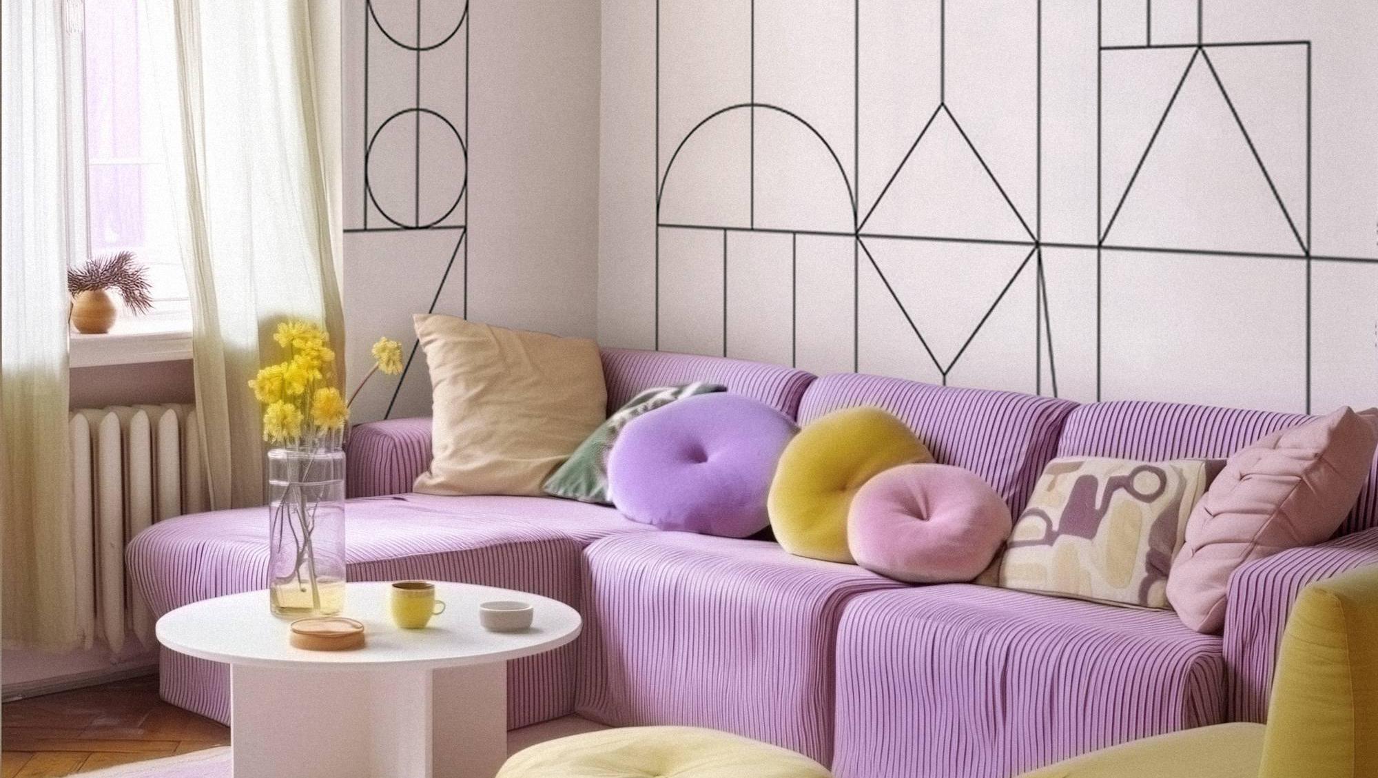
Light-ascending geometric tracery brings the eye both up and outward. Murals from can be scaled to the space and personalised; from €31sq m, Photowall.

Light-ascending geometric tracery brings the eye both up and outward. Murals from can be scaled to the space and personalised; from €31sq m, Photowall.

Wallpaper, murals and even well-applied stencils in paint or plaster can coax problematic spaces into better visual shape. These much-loved interior designer go-tos will not create space in metres and centimetres, but they can improve our perception of what we already have.
Perception is everything. Welcome to the world of visual scaling. We don’t just look at a room. We are complex, wary creatures. We experience it. Here comes a little environmental psychology to get you going.

For this project, being manipulative is completely appropriate. When we look around our rooms, our eyes tend to get snagged on boundaries, lines and the overall direction of things.

We see short walls, uncomfortably lofty ceilings, yawning halls that seem to go on forever, and feel instinctively uneasy.

Airy look

We’re ancient creatures, and we’re designed to look for airy spaces with good vantage points, shelter and escape to survive in the wilds (trust me — look into the Savannah Hypothesis developed by Gordon Orians). I’ve yet to meet anyone who said, “I adore that room, it’s so cramped and small!”

It might be small or structurally challenged, but we don’t have to let our brains process it that way without a challenge and aesthetic cheat.

When you look at a mural or wallpaper — notice the size of the pattern, the direction it appears to be going (even if that’s everywhere), and the colour.

The colour will be divided into that of the pattern and what’s termed the ground colour. Ground colour has an enormous impact on how the image reads when it’s up on the wall, and with wallpaper, you generally have a choice in pattern and ground colour, be it black, white or a designated colour. Starting with pattern size. Roses the size of cabbages or life-sized dabbling cranes are best used on one feature wall, where there is room for dramatically scaled illustrations like this to breathe.

Small delicate patterns can cover a whole room if it’s teased open over a pale or white ground.

You won’t feel you’re getting tangled in the design like a trapped animal if you have an easy view of that refreshing ground colour. Rule-breaking? I love to see rich, opulent, fantasy papers in small, occasional spaces like cloakrooms.

They are a commitment, but with the right lighting, a quality print and richly gilded — they can be fabulous.

Vertical

Vertical wallpapers are not limited to stripes in terms of scaling. A wallpaper, mural or stencil including trees, columns or anything thrusting up to the ceiling should follow the same design principles as vertical stripes.

All of these patterns, including those storytelling murals, bring the eye up, and in nature this would be up to the tree canopy and open sky. This psychological sorcery suggests the ceiling is further away than it is, lifting the lid off a claustrophobic room that makes your nerves vibrate every time you’re in there.

Vertical and horizontal stripes

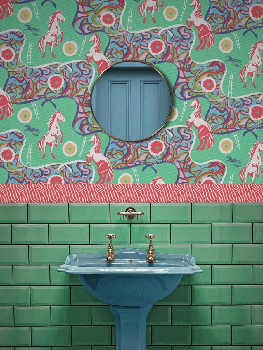
This Stallion Rhapsody paper demonstrates that verticals don't have to go straight up, just as horizontal papers don't have to thrust sharply left to right to rescale the wall; around €246.95 per roll, Divine Savages.

If the stripes on the wall are slender and close together (vertical or horizontal), they might elongate the wall, but there’s a danger of a caged effect that can be unsettling — test a good swathe of paper on the wall for a couple of days.

Horizontal stripes and portrait-scale picture murals (say an uninterrupted beach view with no trees in the foreground) bring the eye along the wall, suggesting to our eager mind that the wall is longer, and consequently, that the room is less cramped. You can double down on this impression with low-backed seating. Any dynamism you introduce must remain comfortable.

If you are using an abstract or biophilic paper, note the direction of the pattern, as you can dial up or down this wall play to suit the space.

A light diagonal flowering climber on a wallpaper can guide our eye up or down, left or right towards a window, door, view or enhance the natural flow of the room. You can try that paper upside down to change its orientation.

Murals

In picture murals, notice how deep the image appears. You should feel you are looking at a photorealistic view. This additional visual dimensionality pushes the wall nicely back. A good image resolution will stand up to very close inspection, showing the picture or pattern, not the pixels it’s made up of.

Period illustrations interpreted in wall-coverings will generally read as quite flat — which is fine if that calm, intricate formality is what you’re after.

Direction

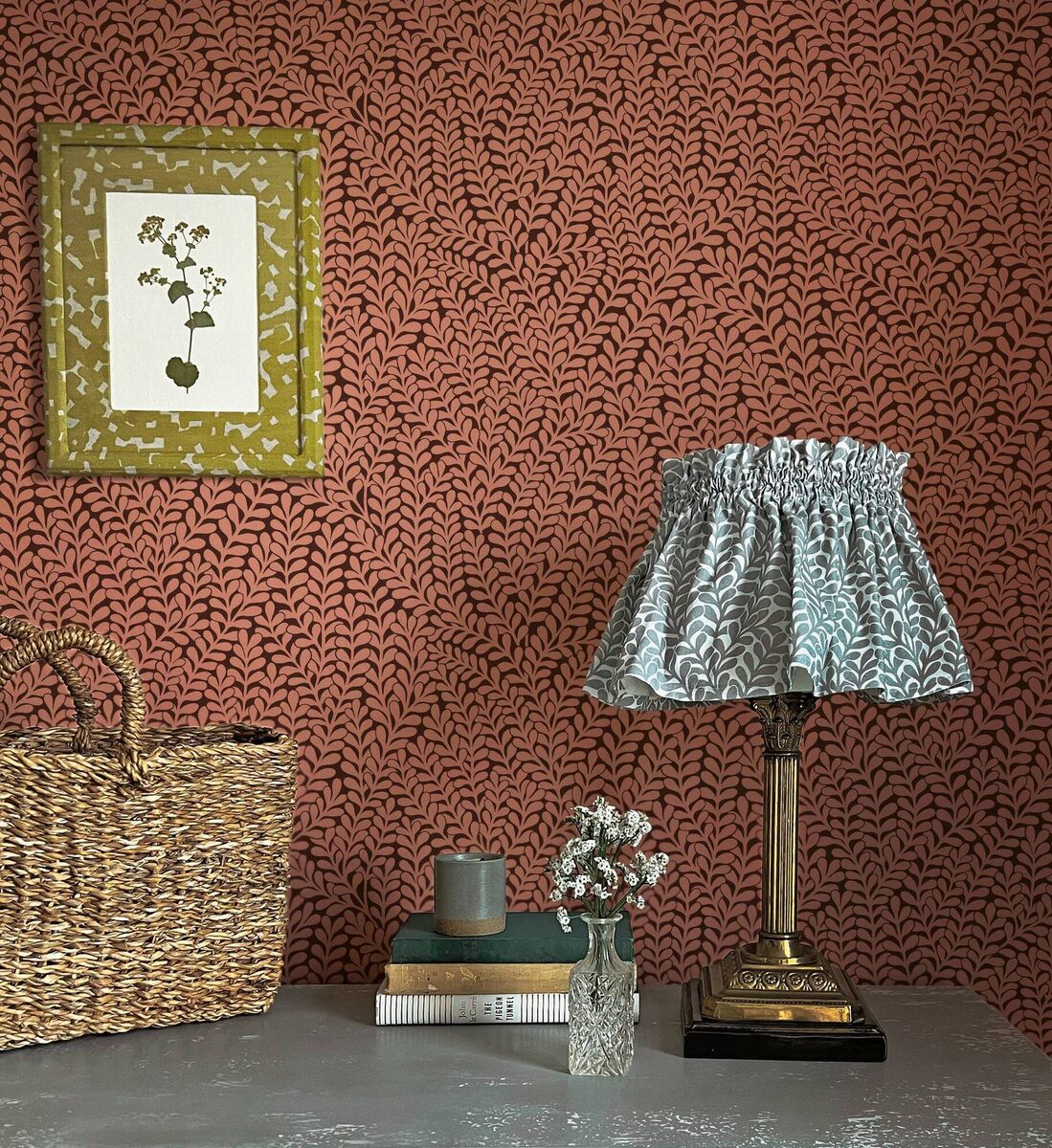
Inspired by the caper, or 'kappar', bushes tumbling down from rock faces and old buildings across the Maltese islands, this paper shows very little ground colour, reading as a paint colour from afar. Maroon and blush pink are right on trend, €229 per roll, Abigail Borg.

When you’re considering pushing the walls around with these techniques, keep in mind that breaking up the direction of the wallpaper will lower its power in terms of visual scaling.

Dado rails and panels

Dado rails, picture rails or using paper above or below panels break the paper or murals’ decorative continuity, reducing its volume, slicing up vertical panels, and reducing its impact (obviously). That said, dado rails can also lead the eye along a room, and filling wall panels with wallpaper is a trending fashion that is not only pretty, but that breaks up a cavernous, boring wall.

Half-walls and ceilings

If you want a half-wall of paper or a mural to bring the eye up — put it over the rail. 

Pale papers will inflate space; darker ones will generally bring them more comfort and closeness.

Taking paper over the ceiling is a very big decision, as taking it down (and potentially upsetting the plaster) will be a major undertaking. If you adore that aesthetic — use a visualiser, setting the paper out in the intended room, in a variety of colourways to be sure you’re not about to get in over your head.

Filling wall panels with paper is a trend that is not just pretty, but that breaks up a cavernous, boring wall

x

More in this section

Revoiced

Newsletter

Had a busy week? Sign up for some of the best reads from the week gone by. Selected just for you.

Cookie Policy Privacy Policy Brand Safety FAQ Help Contact Us Terms and Conditions

© Examiner Echo Group Limited