The science behind the right font choice
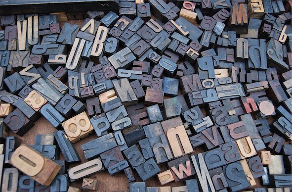
The more we are exposed to different fonts, the more we are psychologically primed to react to them.
Fonts. They are all around us, on-line, off-line, in front of our eyes, and at our fingertips. Although the first font (typeface) was created, along with the printing press, 580 years ago, it is only in the last few decades that most of us have become aware of them. Once computers offered the drop-down menu option of font selection, we all became experts.
Of course, fonts are much more than just a visual packaging for words and phrases. Choosing the right font can change our perceptions, our moods, and even our actions.
What is the difference between font and typeface or are the two terms interchangeable? What most of us refer to as a font (as I do here) is actually a typeface… the specific design of the characters we use to communicate. The font actually refers to how that typeface is presented… bold, italics, size, etc.
We all have a variety of unconscious perceptions and this can extend to the world of fonts too. The more we are exposed to different fonts, the more we are psychologically primed to react to them. Research has indicated that these perceptions can allow us to make emotional attachments to the words we read or even impact our actions. This can prove a useful tool for those in the know, for example, harder to read fonts may be intentionally chosen to give the impression that an item is of better quality than its competitors. We may be blissfully unaware that a font has swayed our decision as we reach for our wallets.
Research has shown that fonts can change how we read a piece of text, and how well we remember it. Fonts that are too easy to read can lead to skimming over the words, with the risk of missing salient points. Fonts that are difficult to read can require too much effort and large bodies of text may be skipped. The secret is finding that sweet spot, the right level of disfluency; if the brain has to work a bit harder to process the information, that information will more likely be retained.
In 2018, a research team in Melbourne, Australia claimed to have found that sweet spot. They designed a font called Sans Forgetica that broke just enough design principles to make it unique, without making it illegible. They reported that their font increased memory retention by more than 10 percent although this claim has since been refuted by a recently published study by an independent research team.
Other fonts that have been created to assist in learning include ones like Dyslexie, created to improve the reading experience for people with dyslexia. Again, independent researchers has reported no benefit in using these specific fonts although fonts such as Helvetica and Verdena do appear to make a difference. Interestingly, the much-maligned font, Comic Sans, also scores well when measuring improved reading experience for people with dyslexia.
Apart from changing how we read, learn or act, fonts may actually change how we perceive taste, according to initial research into something referred to as taste typography. One primary study reported that people rated jelly beans as sweeter when eating them while looking at a curvaceous font, but reported them as more sour while looking at a more jagged font. Such fascinating concepts are leading to new fields of research. Imagine the health benefits if flavour additives (like salt and sugar) could simply be added through font choice alone.


CONNECT WITH US TODAY



Be the first to know the latest news and updates