How to use the colour wheel as a vital tool in your interior decor
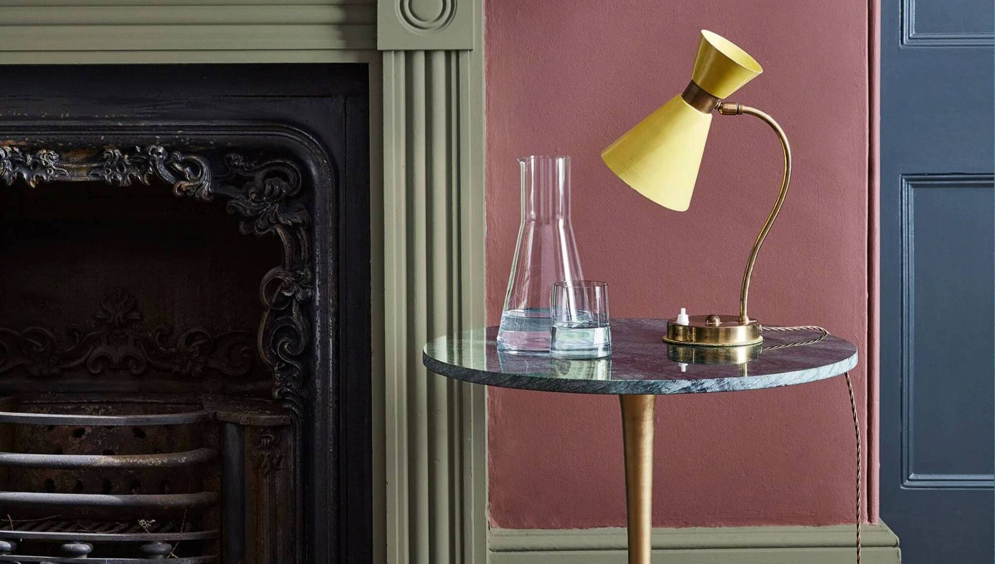
A bold, modern triadic colour scheme hangs on Little Greene's colour for 2026, Adventurer, a warm aubergine. Hicks Blue (door) and Acorn Mid (fireplace). The sizzling yellow vintage lamp holds its own, €38 per litre, suppliers include Hickeys of Maylor Street, Cork.
Choosing colour is often an overwhelming moment. It can drag on, stall in procrastination and panic, and annihilate the initial confidence you had to throw a colour party all over the room. A virtual mood board held in your hand on the phone, or pinned up in slashes of paint, imagery and tugs of material can help to curate an idea to lead you home to a scheme. Working this way is organic, it’s exciting, but it can be chaotic without a little theory to underpin all that instinctive creativity.
The colour wheel is the foundation for understanding colour combining.
Created by Sir Isaac Newton in 1666, it led to the colour theory we use extensively today. Treated as a colour compass, it’s a very accessible and uncomplicated tool to elevate your visual skills when choosing anything from wallpaper for an entire room to the shade of a single cushion.
If you’ve ever been blinded by an all-white room, you’ll understand that few colours work in arrogant isolation and the relationship of one to another can radically alter their life in the light.
Colour wheels come in simple and more professional devices. Most include pointers to isolate promising colour harmonising and complementary combinations, and most are small enough to be popped in a handbag.
A basic wheel has a spectrum spliced into twelve core colours — three primaries, three secondaries and six tertiary colours. The intensity of each colour is then set out. The colour is strongest at the outer edge and reduces in intensity as it moves inward.
Neutrals are not represented on a classic colour wheel, but an interior design colour wheel will often include them, whether a paper style or in an app version.
Proven, working relationships between colours are set out for you once you understand how to navigate around the wheel. Keep a wheel in front of you or put one up online and refer to it as we go over this introduction. Then go further, and experiment with samples, colour cards and all the skills in your visual arsenal. On a board, or on your device — scrapbook, sample, sketch, and build a mood-board as you go.
The colour wheel is a reliable place to reset if you are losing your way. What the wheel won’t do is show what ratio of one colour will sit well with another. This needs further investigation and physical testing on site.
Looking at your wheel, notice how the colours on one side of the wheel move through yellow through red to purple — hot colours that offer a frisson of excitement. On the other side there’s the more restrained character of the blues, greens and purples.
Many colours are underscored by a warmer ochre or a cooler blue base. You’ll soon start to recognise the difference. Mixing two primary colours creates a secondary colour. Tertiary colours are created by mixing a primary colour and an adjacent secondary colour.
Neutral colours (white, black, grey, beiges) are not usually presented on the colour wheel — so be prepared to gather those sample strips and cards, and don’t trust any colour presented on a phone screen or PC screen when buying. Undiluted primary colours will always grab the eye first, so if you want a colour to pop, even in a harmonising scheme, include a primary colour or close to a primary colour. Here are three schemes you can set out to explore with any wheel before you drill down on specific shades.
Read More

There can be hidden pitfalls when you opt for a tonal or monochromatic scheme.
Select just one hero colour on the wheel and read it from the outside, deeper colour to the centre as it pales. Paint sample strips offer this alchemy as standard. Tonal shifts are brilliant for adding interest to walls within a room.
If you go tonal, it’s vital to add interest with other sensations, including texture, to prevent a one-colour choice simply reading as a soul-sucking bore. Explore the 60/30/10 rule (light/middling/dark) to keep things balanced but lively in family spaces.
Rooms consisting of one colour without a shift in intensity take a lot of confidence, but with the strong design elements created by furniture and raised pattern taking the eye around the room, they can be serene, magical spaces. Notice how one room leads to another.
Rather than creating a visual stutter, consider using varying tones of one colour room to room.
Monochromatic beloved blues and burgundy if you’re brave.
Look at the colours snuggled right up against each other on the wheel. These colours will layer up comfortably together without any trembling drama. You can slide in and out to the centre of the wheel to vary the intensity of the colour to make one colour sit up over another. Don’t just pick one saturation for every shade and stop there.
Where you intend to take colour over large surfaces such as walls or carpets, sample them in areas of at least 1.5m square in samples and testers. Finally, when you’re satisfied with your harmonising colours, consider reaching across for a complementary colour and introduce an accent.
monochromatic pinks with grey velvet. Harmonising colour can be used for double-drenching.

Complementary colours are ideal to zone rooms or simply play up doors and second fixes. Also termed contrasting colours — oddly, not all contrasting colours are complementary colours. Any colour sitting well apart from another can act as a contrasting colour. Some contrasts can cause just too much aesthetic tension. Be careful. Designers use complementary colour for bold, dynamic whole-room scheming and small quantities of accent colour against neutrals and other colours.
Take a representative colour you are drawn to from the wheel, and trace it to the opposite side of the wheel. This is always a complementary colour. This is a complicated area, but if any supposedly complementary combination seems just uncomfortable, play with the tone and saturation.
Matcha greens and grey dusted pinks.
Now you have three choices instead of one. A highly popular device to add more dimension to a room, many wheels will offer a triangular guide that will slide to the split complementary to get you started here.
First, go to the complementary colour of your chosen colour, and look at the colours left and right of the exact complementary colour. These will have a mixture like red-orange or yellow-orange, flanking a purer (secondary) orange.
Select one colour of the three to take the lead. Some colours are notorious thugs. In a room accented in orange and blue, orange is a bit of a screeching diva, and best corralled to smaller juicy quantities and tamer tones.
Deep blues, butter yellows and terracotta with a new showing of urban red.
Triadic colours (contrasts and accents) are very vibrant — some would say an aesthetic slap on the puss. This is a more difficult area to work off a wheel (I would refer to a successful scheme in a good image to get your hand on the rudder).
We take three colours at three equidistant points on the colour wheel (there’s a triangle at the centre of the wheel we slide around to find potential choices at 120 degrees) and we use those in the right ratio. These can be used as accents against neutral or white walls (usual) or be cloaked all over a room in highly theatrical colour play.
A triadic scheme can deliver architectural chic or go seriously wrong, straying into playroom cringe. Take your time.
Red, yellow and blue remain a firmly mid-century triadic. Experiment with a slide into Mediterranean cousin colours.
Wherever you think you’re going with a colour scheme, there’s no shortcut to actual testing at home, including app-based visualisers.
Pigments and dyes present in paint and materials react differently according to the environment and look vastly different over large expanses.
Paint it on, use a mini-roller, stick up those tester cards in every light condition. All colours should be introduced together in place (scaled to each other) before you pluck up a lid, or order in one metre of fabric.