Our top three pink picks for home interior colour schemes
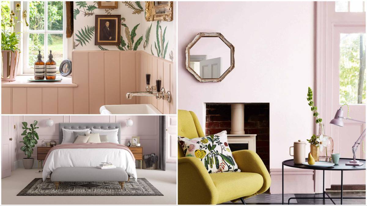
Farrow & Ball's Setting Plaster, top left, Dulux Heritage Potters Pink, below left, and Little Greene Dorchester Pink.
Forget the eye-watering Barbie pinks we suffered a couple of years ago, and embrace a new collection of subtle, chic, comfortable blushes as we look to Autumn/Winter 2026. Think pink and beige waltzing together.
What? Surely that’s magnolia. No — the saviour here is that these colours lean more towards clay and away from any rosiness that could drag us back to chintz and bad design steers of the 1980s.
Deeper, earthier, more spice and less sugar. Here are just three grounded pinks to consider for testing. Search under “plaster” for other possibilities.
Having long recognised the appeal of unpainted plaster and skim, this gorgeous colour from F&B has a relaxing grey undertone that allows it to act as a true neutral in many settings.

A real contender, freshened with white and accented with deep greens; from €75 for 2.5l in estate emulsion or €82 in modern emulsion.
I love this fragile take on plaster pink launched in 2024. It has a soft, dusty feminine quality, and is beautiful used with pale greys in a tonal scheme, or to set up deeper ruby colours.

Try it to warm a northern room, with a drenching colour taken over four walls, including skirting; from €58 for 2.5l, matt emulsion.
If you fancy a true distemper paint, with high opacity, low odour, and a chalky matt finish, Little Greene’s Hard Distemper is suitable for walls, ceilings and fine plasterwork.

It’s superb for period properties with walls that are intentionally porous and prone to damp penetration. Expect any distemper to show slight shifts in colour due to humidity and don’t use in areas of high condensation.
For a deeper pink, try Pink Slip (No. 220) and for a greyer pink, test Dorchester Pink (Deep No. 213, shown); from €122 for 5l, Littlegreene.ie.