City pad puts on its clad rags
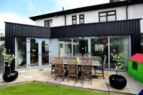
CUTTING your cloth to measure can mean many things — however, in the context of this Dublin extension it meant taking a huge jump from sophisticated, but expensive zinc to corrugated cladding more typical of cow sheds. But just look. Isn’t it amazing?
The clients took a bit of risk when the newer material was proposed by David Smith, of Davey and Smith architects, (pictured below) but they took the plunge and added a showstopper to the makeover of their 1930s semi on Dublin’s northside.
The stark, black cladding has created a dramatic, brake-screeching effect for passersby on narrow Phillipsburgh Avenue in Dublin 3.
The rock ’n’ roll finish isn’t usual in a chunk of ‘Bertie Country’ not normally associated with outbursts of architectural elan. But in this case, the choice of material cut the costs of an ambitious project in the now usual tale of a Tiger turnaround.
Overblown plans not matched by cash-flow were abandoned or trimmed severely in the new austerity, and in a way, has allowed creativity to flourish.
The project, on a corner site with two-storey and single-storey extensions, managed to go through and it’s hard to believe there were compromises made here — it’s quite sumptuous internally.
But then, the substitution of industrial cladding on part of the facade allowed a quality internal finish, says Smith, who designed the rest of the scheme to reflect the architecture of the existing dwelling.
The clad elevation is only one minor part of an overhaul that included a garage conversion, attic conversion, side extension and single-storey, kitchen/ living/dining room projection.
The old semi-d on its corner site was to retain its original facade of white-painted pebble dash with red-brick highlights, while the extension to the side would to be clad in zinc.
The house sits on a odd shaped, corner site, which meant that planning a straight forward extension was out of the question, especially when one of the clients wanted to retain the garage for a hobby micro-brewery.
This meant a lot of integration and oblique design work to fit everything into the site, as Smith says:
“We were initially approached by the clients to investigate the potential for refurbishment and extension of their existing, two-storey semi-detached home on Phillipsburgh Avenue on the north side of Dublin City.
“The house sat on an awkward, wedge-shaped corner site with an east-west orientation. They had both given plenty of thought to what they wanted — a brief consisting of a new, contemporary rear living/ kitchen/dining/utility area, new master bedroom extension at first floor, attic conversion and garage conversion into a home brewery, all for a modest budget”.
Davey and Smith provided an initial plan that would work with the site and its sun path, but the budget meant that certain items in the wish-list had to reconfigured:
“We investigated and prioritised what spaces within the brief were important for the family. The result was the omission of the garage conversion, and reduction of the specification in external finishes in favour of good-quality, internal finishes to the new areas.”
Which sounds like a plan — while the look of a building is important, in straitened times it makes sense to give priority to the private space.
Because the interior took precedence, the cost of the external cladding had to be reduced, which led to the avant garde approach of using industrial quality, agricultural cladding in matt black.
The costs were brought down while edginess increased in inverse proportion. Win, win.
The corner angle is just one small part of the main house, a dwelling that is quite in keeping with its neighbours. In fact, the interior layout reflects and respects its two periods — the 20th century core and 21st century extension. The three-bed semi has a double-height extension at the side, providing a new, master suite overhead and study and utility below.
The short run of extension seen from the road belies the amount of single-storey that projects into the west-facing garden.
The architects used the floor plan of the existing garage in a wing-shaped addition that wraps around a private garden space at the rear.
“The solution we proposed was to fill in the voids, between the garage and main house, with the living and kitchen spaces, and orientate them all to the rear west-facing garden, while providing a barrier from the road to the front of the house.
“This finish was also vertically ribbed to create a play of shadow across the surface and to hide the fixings and imperfections of what is, essentially, an industrial and agricultural, cladding material.”
Internally, the back walls of the existing house were almost removed and while the clients and their two kids braved the building project for a while, they had to move out in the end. The extent of the work involved was huge and, in reality, affected every room of the house.
A nightmare while it’s going on, but magic when finished — this old-stock, northside home has now doubled in size, with great light and a good flow of rooms throughout.
The classic styling in the main living room is retained, but all of the ground floor rooms stick to the same palette, white walls and walnut flooring which links the old and new beautifully.
Folding, glazed doors, (in a similar style to the old house), connect through to the new living room, where the back wall has been pushed into the garden to achieve a huge, living, dining and kitchen space. But it’s not all open-plan, because the extension is winged at the rear and because of the wide roof span, part of the old gable wall has been retained for support.
However, it cleverly breaks up a potentially cavernous space into defined zones, while allowing a free-flow of rooms — perfect for young children. The short wall occludes the functionality of the kitchen area from the living room, where the furniture is set around a new, slot-in stove and with sliding doors to frame the garden view and give direct access outside.
The kitchen is a clever room, using the high windows punched out of the cladding to borrow south-facing light inside and with a working area confined to one wall with a long, functional island in front. A utility room is tucked neatly to one side, taken out of the two-storey addition, while the dining area is closer to the garden and has direct access through double doors.
The volumes are good and the asymmetry of the space is highlighted by the confluence of walnut flooring with kitchen tiling; the look is simple but ergonomic, with a limited palette of materials. Units are off-white with black granite worktops, walls are similar, and flooring is walnut: old meets new quite nicely with the use of a pivot door at the hallway’s end, creating a clear boundary between the new extension and the old, ’30s/ ’40s entrance hallway.
Meanwhile, part of the garage has been retained as a micro-brewery, tucked away in a corner of the garden and a must-have for one half of the commissioning couple. It adjoins the new extension, but has access from the side, too, through an almost hidden door cut into the cladding.
The windows and door were carefully handled at the construction stage, says Smith, with attention to the key details making the difference between a striking effect or a botched job — the pictures tell the story.
Overall, the extent of the remodelling/ rebuild is remarkable considering it was conjured out of what was an unwieldy space, but it’s a very good example of what can be done with good design in even the most intricate spaces. And despite all the teething troubles, and the economic crash, the young family are in situ now, and quite happy with their easily managed, modern/ old home in a central, Dublin city location.
Despite the upheaval involved, they are pleased with the result — and the brazenness of the extension — which has been quietly assumed into the neighbourhood — a job well done.
CONNECT WITH US TODAY



Be the first to know the latest news and updates