Jennifer Sheahan: New year, new paint colours 
Check out the shades we can expect to see on walls this year
Jennifer Sheahan: New year, new paint colours 

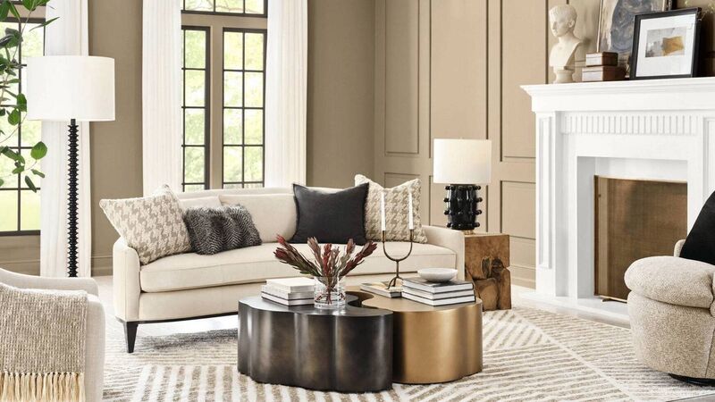
'Universal Khaki', Sherwin Williams.

Every year, the major colour companies release their own “Colour of the Year,” which always causes ripples of excitement among design communities. A lot of thought and research goes into these colours — they’re reflections of global mood and cultural shifts. Of course, we’re not actually expected to paint our homes in whatever shade Benjamin Moore or Pantone conjures up. 

Colour trends will typically have bigger impacts in digital and print design than on home interiors — items that are more fleeting than our painted walls. But colours of the year inevitably both predict and influence our preferences, and once you are aware of the current trends, you will see them everywhere; in homewares shops and magazines, on Instagram and Pinterest.

The Zeitgeist 

Ultimately, these colour trends are as much emotional as they are aesthetic. The 2026 colours tell us that we are leaning towards homes that feel restorative and calm. They reflect the fact that we crave tactile comfort, connection with nature, and a sense of tranquillity. 

Benjamin Moore 'Silhouette'.

They go hand in hand with our growing awareness of the benefits of quality over disposable convenience. They pair with good craftsmanship, organic materials, and attention to detail. They scream solidity and permanence, emanating reassurance and a slower pace.

Why should you care?

I’m not here to tell you to jump on the trends train, but being aware of what’s hot right now is important if you’re making any interior design decisions. There’s nothing wrong with choosing something on trend, but knowing what is influencing your choice will help you make a better one that is more likely to stand the test of time. So with that in mind, here is my interpretation of the 2026 colours of the year, and what they spell for our home interiors preferences.

Earthy neutrals 

Almost across the board, the 2026 palettes lean soft, earthy, and cocooning. Think muddy greens, warm neutrals, softened blues, clay browns, and muted rose tones. These are soothing, gentle, atmospheric colours that embody the “quiet luxury” trend. They evoke feelings of stability and comfort — unsurprising, we collectively crave this after years of global volatility.

As trends go, this is one I can firmly get on board with. The earthy, neutral colour palette is accompanied by a large-scale movement towards natural materials in interior design, and that is something that will never go out of style. I’m a personal fan of bold colours, but these can be easily layered in, so as paint choices go, I’ll never argue with a neutral canvas.

Dig deeper 

While the continuing trend this year is far away from the bright and vibrant hues that were trending a few years ago — Pantone’s Viva Magenta in 2023 — and firmly towards earthy neutrals, it’s not a bland beige landscape by any means. 

Little Greene's 'Adventurer'.

There are richly pigmented colours signalling a move towards a deeper, moodier atmosphere. Little Greene’s colour of 2026 is “Adventurer”, a deeply rich aubergine, which can still be classified as earthy but is bolder than the more muted colours that have been popular. 

Colour-drenching has been a widespread trend of late (and it has my vote to be brought in as a permanent design feature) that has enabled us to lean into these richer colours. 

Removing the contrast of white skirting boards and architraves allows these colours to do what they do best — create atmospheric cocoons in the form of cosy bedrooms and cave-like living rooms.

Cool to warm 

Nearly every 2026 palette has moved away from cool greys into sand tones, chalky taupes, honeyed neutrals, and clay tints. We are fully embracing warmth, and thank goodness — we get way too much grey in Ireland as it is, and we need warmth in our colour palettes to create a feeling of welcome and homeliness.

Jewel tones 

One of the outliers, Dulux, chose a trio of blue colours for its 2026 Colour of the Year — “Free Groove”, “Mellow Flow”, and “Slow Swing”. “Free Groove” in particular is a vibrant hue, though all three have soothing indigo undertones, with the intention of providing the same calming influence as the earthy neutral tones. 

Dulux's trio of colours of the year.

American paint company Behr chose “Hidden Gem” — a deep, jewelled jade-green, and once again, this provides a more vibrant yet calming effect. Much as I love the earthy colours, I’m interested to see these deep jewel tones appearing to complement and enrich the neutral palette.

Texture is key 

A trend that is inextricable from these neutral, organic, earthy palettes is texture. While texture is always important in interior design, it comes even more to the fore when colours are this muted. All drama must come from contrasting materials — plaster, wood, linen, wool, matte tile, and brushed metals. The shift toward softer colours and organic materials is paired with a renewed interest in tactility. This results in rooms that are more atmospheric, cosy, and luxurious.

Bring it home

In practical terms, it’s a good time to redecorate. The colours that are trending now are not colours that will easily date, or that demand bravery and bold visions. They are colours that work well with natural timber, stone floors, wool throws, and a texture-heavy, comfort-first aesthetic. They are colours that work well in our climate and with our natural surroundings. If you’ve been lamenting your cold grey walls or feeling the urge to repaint your “pandemic feature wall,” then this 2026 palette offers a generous alternative that will stand the test of time.

x

More in this section

Revoiced

Newsletter

Sign up to the best reads of the week from irishexaminer.com selected just for you.

Cookie Policy Privacy Policy Brand Safety FAQ Help Contact Us Terms and Conditions

© Examiner Echo Group Limited