How to use pops of colour to transform your home

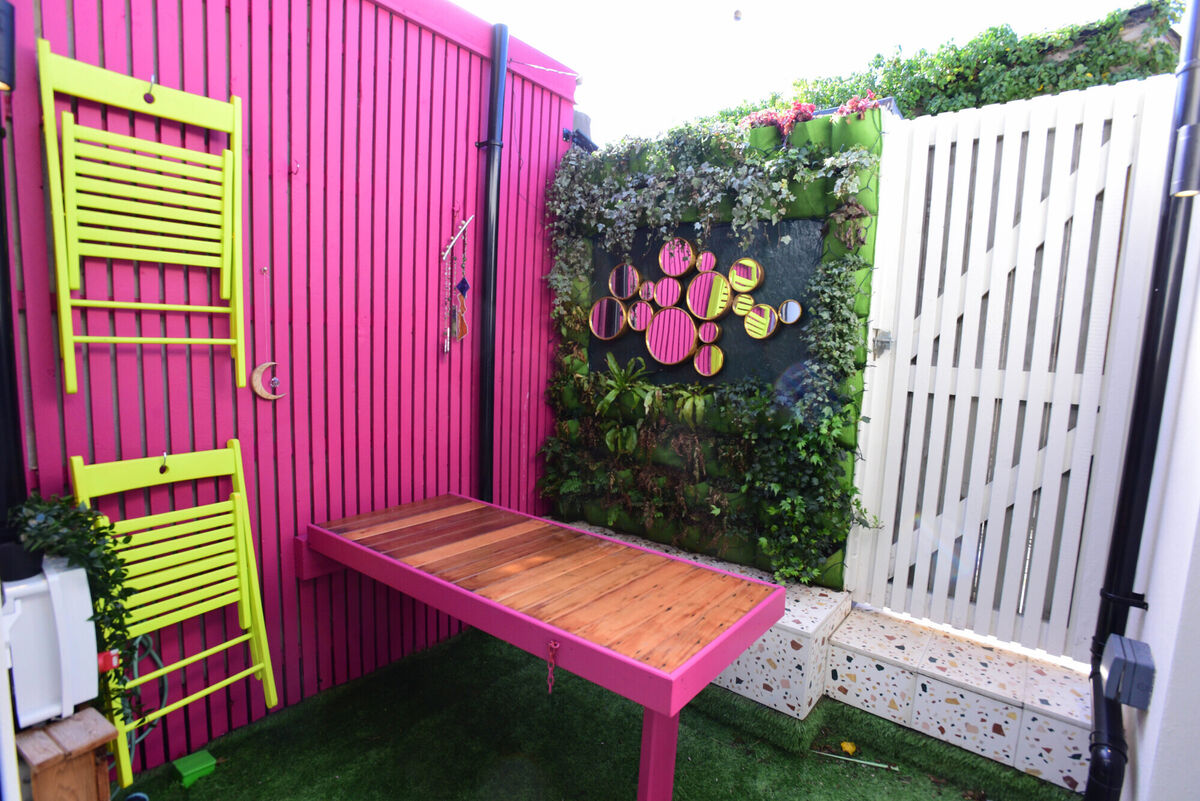
Choose complementary colours for dramatic contrast, as Jennifer Shehan has done in her outdoor space. Pictures: Moya Nolan
How many times have you heard “it just needs a pop of colour” — as if it were that easy. What colour? More than one? Where?! How much is enough and when have you gone too far?
It’s the accents, the little touches and final flourishes, that can make or break your design and therefore require finesse. A well-placed pop of colour can be the design magic you need. It can add personality, create a focal point, and even transform the mood of a room.
A misplaced pop of colour, in contrast, looks disjointed and feels uncomfortable. Through lots of practice (any many mistakes) I finally feel like I have refined the art of the colour pop. Here are my best guidelines so you can get it right in your home, from finding the perfect hue to creative ways to introduce it.
The first step is to define what you want to achieve by bringing in some colour — what does the room need? Do you want to bring in vibrancy and energy, or some elegant sophistication? Is the purpose to show off your personality or simply to make the room feel less … flat?
Deciding what mood and style you want to inject into the room will help you to narrow down which colour to bring in and how, from a bright fluorescent splash to a subtle tonal contrast.
I’m not a minimalist, and generally my preferred style is neutral walls and floors with splashes of bright furniture and accessories in a cohesive palette. I also adore a monochrome room, where the “pops” of colour are really variations in tone of the same shade.
If you’re more of a minimalist, a mostly neutral room with some “pops” of deep earthy or calm pastel shades will be the right choice for you.

The most dramatic effect of all is bringing in just one colour against a white or neutral background, and I adore this look — picture a stark white room with white furniture, with a striking cobalt blue chandelier, footstool, and vase.
Whatever your preference, it’s good to have one predominant colour on larger items, and if you wish to bring in additional colours do so with smaller accent pieces or through the use of patterns.
Next is choosing a colour that achieves your desired effect while complementing your existing décor. Warm colours like reds and oranges evoke energy, while cool colours like blues and greens promote tranquillity.
Consider also the relationship of the colour you’re introducing to the existing colours in your room — for example on wall paint, furniture upholstery, or flooring. For this I recommend using a colour wheel, which has been around forever and remains incredibly useful.

If you want to bring in some energy and contrast, choose a complementary colour (opposite each other on the wheel) — if your predominant existing colour is blue, you would choose an orange colour pop. If you want a more subtle harmonious feeling, choose an analogous colour (beside each other on the wheel). If your room is devoid of any strong existing colours, identify the undertones in your neutral scheme.
Remember that lighting affects colours, so test samples in the room first at various times of the day.
Textiles and accessories are the obvious choice for versatile ways to bring in pops of colour, especially as they’re easily changed so you can update when you feel you need a refresh! Pillows, rugs, curtains, upholstery, paintings, frames, sculptures, vases, and books are some easy ways to bring in colour.
You could also paint or add wallpaper to a piece of furniture or a section of a wall — I love this on an archway or alcove, or the back of a bookshelf. And don’t forget flowers, the easiest of all to swap out when you feel like a change. When using pops of colour, it's important to maintain balance.
The “rule of threes” is a helpful guideline. Limit your accent colour to three distinct elements within the room — one lamp, a piece of artwork, and cushions on a sofa. This creates visual interest without overwhelming the space.
Once you've incorporated your pops of colour, take a step back and assess the overall effect. It takes some practice and tweaking to get it feeling right, and ultimately you need to rely on your gut to tell you when you have it just right.
Fine tune the placement of items for optimal balance, so that they’re relatively evenly spread throughout the room. Add finishing touches like fresh flowers or colourful coasters to complete the look.
Once you’ve got the hang of it, you can switch up the mood of your room as you please — perhaps for a seasonal refresh.


CONNECT WITH US TODAY


Be the first to know the latest news and updates


.jpeg")


