DIY: Let’s take the great white way
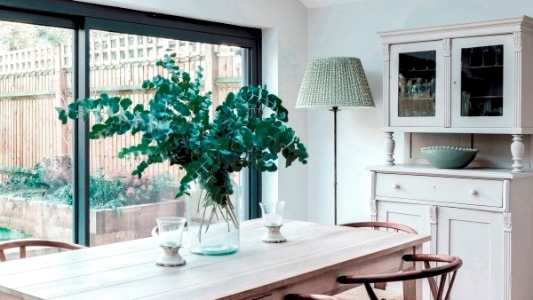
argues for white as a primary ‘real’ colour transcending trends but advises you check those undertones.
Designers and talking heads promote emotional fantasies around Pantone’s colour of 2019 — Living Coral. Prepare yourself: “Warmth and nourishment to provide comfort and buoyancy in our continually shifting environment” (Pantone Press Office).
Architects have since the 1950s, presented their best, interior career moments in white.
They still do. Rifle through the RIAI opus — it’s all the pure driven stuff enhancing every plane and curve.
Still, for us lay, uncertain creatures, is white as a lead just aesthetic surrender?
Here are a few ideas to get you going on the great white way, one that has transcended mere fashion for centuries.
Line, shadow, texture
Most art galleries favour white walls for presenting most (if not all) of their major collections in painting, sculpture and installation work.
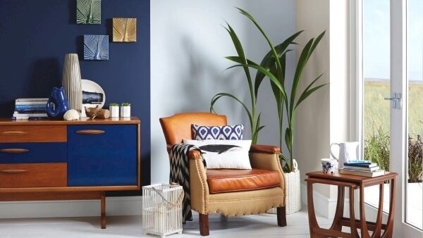
Take out bold colour from your walling and the texture, line and colour of other objects can sit up as tender moments and brave colour blocks.
Still too much of the pure stuff — pale and disinteresting. It’s up to you to put on a show.
Shadow evoked by deep architectural elements, stroked by the right lighting can really come out to play.
For touch and tint — velvet drinks light into it short pile, shimmers in places and is set to remain the upholstery pelt of choice for next year.
Space magic
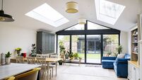
Aside from its talent for soul touching tranquillity, nothing, but nothing apparently inflates space like white.
Reflecting every lumen of available natural and artificial light (even applied matt), bouncing it out of corners and rendering even wavy, dinged plaster without sin, white can take on a lumpy cottage wall as effortlessly as a pokey urban apartment.
Throw in some mirrors, tear off those stifling window treatments, and that rat trap will visually levitate.
Using brilliant white together with just off-white shades can cleverly alter the proportions of a room — sending walls and ceilings up and back, or bringing ceilings lower (darken the choice) and bringing features forward as highlights.
Purely practical
In the future white or pale off white offers a superb undercoat for other pale to mid neutrals if and when you decide to jump off the great white way.
Pure brilliant white is also the least expensive option per litre for a first or freshening coat compared to those tinted designer confections.
Always redo the whole wall — patch repair never works well.
Ensure fresh plaster gets a dilute thin undercoat.
Why pay more? Better branded white will be acrylic and pigment rich, requiring less coast — honestly, most are generally very well priced.
Balance
Despite its wavelength innocence, an unadulterated absence of colour, delivered on every greater surface can create a repelling, edgy, formal glare.
Use a mood board to anchor the room on white or ultra pale neutral (put a ratio of more white in the mix of fabric snips, emulsion daubs and torn pages until you feel your shoulders relax).
Still chill? Step out of pure driven snow to tinted off white and punctuate with moments of colour.
White on white is the single most difficult scheme to get right — take your time, shuffle your samples with fabric and colour swatches on a large mood-board.
New neutrals
Immaculate all white habitats applied to family homes are doomed from the get go and for children and pets are downright excluding.
Walls in a scrub-clean choice have the best chance, but chairs coverings, kitchen cabinetry and flooring — forget it.
A fragile “rain” grey is a popular contemporary neutral and freshened with white woodwork, a firm modern classic.
Test, test, test (see our guide). Look out for the appearance of terrazzo plaster and tiling on walls not just floors — white-based gem mixes.
Aspect and colour
For north-facing rooms, try yellow-based neutrals by day — wildly popular this summer.
South-facing rooms with plenty of glazing can take red and blue-tinted whites with ease, and facing west even pure white will survive in a relatively golden light most of the year.
Don’t go by any rules, test with real paint directly on the wall or lining paper.
Your eye is more sophisticated than any algorithm.
With a white painted room with inoffensive flooring, you can swap out accessorising brights season on season.
Monochrome tamed
Black and white is the ultimate in interior theatrics. Searing relief and unapologetic contrast is daring stuff.
Place a disparate real thing in this stage set – for example a stained sports sock or an exploded cornflakes – it’s over.
Delivered full on it monochrome can read as dated, pretentious and downright clumsy.
Try shadings of pale grey with bold black moments.
This year’s continuing flirt with smoked glass married to clean 70s lines with warming toffee dark timber elements, stirs in elegant craft and natural notes, while still delivering the glamour of dark floating on light.
Walk around Meadows & Byrne — it’s all there.
Do deco
White was a revolution in terms of interiors in 1919. If one period look has survived the popular demolition of Victorian and Edwardian fuss it’s Art Deco and the appeal of 1970s louche has brought flash, excess and a trill of nightclub luxury back into focus.
Silver, black and white delivers the jazz age aplomb of Hercules Poirot’s apartment.
Go vintage or indicate the current luxe trend with new modern masters.
Chrome-slicked black and white in the syle of Eames, Jacobsen, Van der Rohe and Eileen Gray — chic for adults and a total disaster for yogurt-toting tots.
CONNECT WITH US TODAY



Be the first to know the latest news and updates