Colour choices can transform your home and boost your mood
Colour choices can transform your home and boost your mood, writes
Have you ever picked up a book on interior design and instead of it helping determine how to create the style you want for your home, all it achieved was someone else’s idea of how it ought to look?
This is especially true when it comes to the complex process of choosing colour, a topic hard to avoid as colour across the spectrum is trending large with no sign of being on the wane.
But when trends become the main factor in informing our colour choices, where does that leave us when the trend proves temporary and fades into oblivion, only to be replaced with something new?
Interiors fashions change as frequently as clothes’ fashions these days.
Do a quick Google of the words ‘colour’ and ‘mood’ together and it will return over 100m results. It’s a serious topic by the looks of it, with some science attached for those who think science trumps instinct.
The Australia-based Florey Institute of Neuroscience and Mental Health, which describes itself as the leading brain research facility in the southern hemisphere, has recently published research indicating that different colours bring out a whole range of emotions from relaxed and calm, to bored, sad, tense and even irritable.
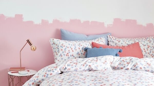
Red, it turns out, is an adrenaline pumper, raises blood pressure, speeds up our respiratory system and heart rate. It’s hardly surprising to find it’s the colour associated with passion, excitement and stimulation, so it’s not ideal for bedrooms where calm and rest are paramount unless you’re prioritising less passive activities there.
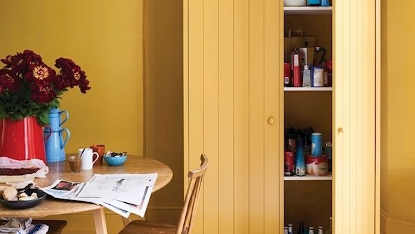
Staying with the stimulating and exciting shades, yellow is uplifting and fosters conversation and energy in dining rooms and kitchens, but with too much use it can also cause irritability as it stimulates the central nervous system. Believe it or not, studies have shown that babies cry more in yellow rooms. Now, there’s a shocker for parents who opted for gender-neutral yellow in the baby’s room.
Blue is yellow’s antithesis, being the colour of calm, slowing down the heart rate, breath, and reducing blood pressure, it’s claimed. So, if relaxation is your bedroom priority, blue could be the hue for you.
It can be a tad chilly, though, depending on how pale you go, so for something warmer turquoise is an option, or even the current trend for inky blue and indigo shades which are being touted as cosy- inducing colours for winter hibernation.
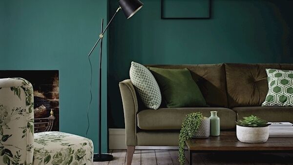
Would-be parents take note of this: Green is associated with fertility so consider it an option for the bedroom. It also has associations with relaxation as it creates a calm visual, rather like looking at nature so it could be a hit with people who love being outdoors.
Purple anyone? Not too many of us are likely to choose purple as a main colour, although it has connotations with luxury and opulence. Apparently, it’s a good colour to have around for stimulating a creative spark, but maybe in small doses as an accent colour. For an all-over colour, gentler and paler versions of lavender and lilac could prove easier to live with as the seasons change.
It’s been a while, maybe even two decades, since orange was a fashion colour for interiors, and even then it was the must-have terracotta, beloved of home decorating programmes like the BBC’s Changing Rooms in the 1990s which had DIY enthusiasts having a go at home-spun interior design.
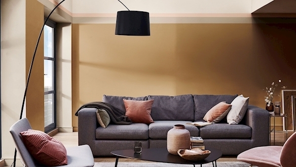
All of a sudden we have terracotta back in paint, upholstery and textiles, so if you want the excitement orange is said to stimulate, but maybe slightly toned down so it can be lived with at times other than Halloween, terracotta is the way to go.
If it’s a step too far back to the 1990s, a lighter honey tone is touted now as the new terracotta.
Dulux has jumped on this when it comes to their annual colour predictions and recently announced Spiced Honey as its Colour of the Year 2019.
The paint maker’s creative director, Marianne Shillingford describes it as “stimulating and energising”, and at the same time calls it “calming and nourishing”.
It sounds like it has a bit of everything so maybe
Perhaps those honeyed hues which are trending with such force right now might be a way forward, offering something new while playing to an ideal environment of something balancing between stimulating and relaxing.
CONNECT WITH US TODAY



Be the first to know the latest news and updates