Greenland isn’t as big as you think: Why the world map we know is misleading
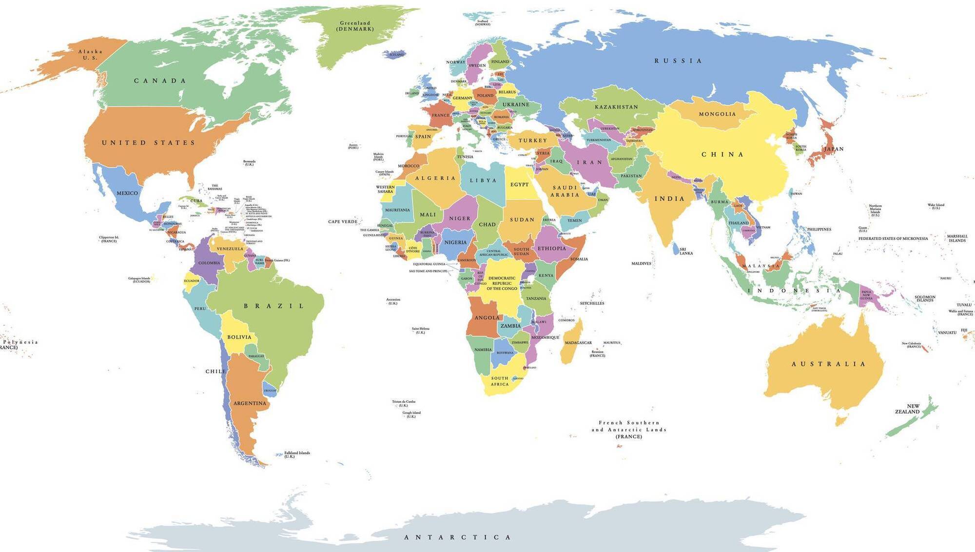
A new UN-backed campaign is challenging the familiar Mercator projection and asking whether maps shape how we perceive global power
To help sailors navigate enormous distances using a compass, Gerardus Mercator's projection allowed a course of constant compass bearing to appear as a straight line on a map. Picture: iStock
Greenland is enormous. Or at least it is on the world map most of us grew up looking at.
There, suspended above Europe and Canada, it appears roughly comparable in size to Africa. It isn't. You could fit Greenland into Africa about 14 times.
This is exclusive subscriber content. Already a subscriber? Sign in
Save €40 on an Annual Subscription.
Unlock this article and get unlimited access to news, sport, opinion, podcasts and more.