Waterford FC’s new crest has received a very mixed reaction

It’s the week of controversial club rebranding launches, .
First there was Juventus, with their minimalist Js replacing the traditional oval shield for the 2017/18 season.
Juventus have unnecessarily decided to change their logo. Not a fan pic.twitter.com/l9zwA9Exo5
— Simon Peach (@SimonPeach) January 16, 2017
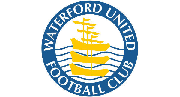
Now, Waterford FC (formerly Waterford United) have revealed their own crest-rebrand.
They go from the long-standing boats-in-a-circle look…
To a shield featuring the fleet of boats, plus three lions…
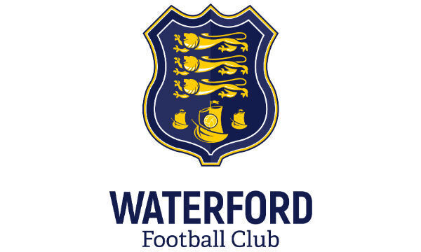
The club explains: “Our new crest is a modernisation on a previously used Waterford FC crest and strongly ties in with the original Waterford City Coat of Arms that was carried as the club’s identity upon formation in 1930.
“Whilst the club’s crest as well as the Waterford City Coat of Arms has undergone changes since then, tying in with the club’s founding roots is an important part of Chairman Lee Power’s vision for Waterford Football Club.”
Some of the Twitter community, however, think it reminds them of something else…
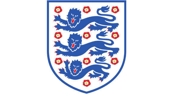
England called they want their crest back lads https://t.co/IqQ0chxSIj
— Eileen (@eileeno10) January 20, 2017
Is this a joke?
— Richard Herity (@officialrherity) January 20, 2017
Stuart Pearce to do the official unveiling
— E0IN (@KeatingEoin) January 20, 2017
Waterford following in the footsteps of Juventus launching a new crest this week. Looks very English. Three lions on a shirt... https://t.co/MlyT2H2UCD
— Conor Casey (@conorhcasey) January 20, 2017
New chairman and owner Lee Power said: “When I assumed control of the club in November, I wanted to look at the option of re-branding the club and returning to our original identity.
“I am delighted that we are returning to the Waterford FC name along with a modern crest that is inspired by the club’s historic past.”
Other commenters online, like Power, were happy to see the club increase links to its foundation.
1930-2017 Waterford FC #revive #reborn #blues pic.twitter.com/CG7xucrS5J
— Gary Power (@garypower85) January 20, 2017
Waterford FC! 💙 pic.twitter.com/bUJy8h6VsB
— Pencil Head (@RobboGordon) January 20, 2017
Fantastic crest superb to c the club going in the right direction . To all ye begrudgers go F#@k urselves we suffered enough
— Ray Malone (@rayhibs) January 20, 2017
What do you think of the change?


CONNECT WITH US TODAY


Be the first to know the latest news and updates


.png")


