Revealed: Top paint colours for home makeovers this spring
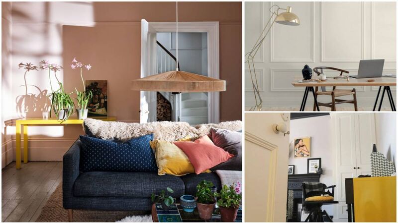
Setting Plaster by Farrow & Ball, left, Batch Loaf is one of Colourtrend's neutrals, top right; walls finished in Acres Hall's Clay Bowl neutral hue, bottom right.
After seasons of dark shades washed over walls, skirting and doors, it’s time to lighten the palette especially if you’re sick of the sight of an impulsive dark paint experiment.
Trying to erase it might seem daunting but it doesn’t have to be, according to Lorraine O’Leary, one half of mother and daughter decorating duo, LM Décor.
“Transitioning back to paler hues adds an airy, brighter feel to a room which a lot of people veer towards after the winter months,” she says. “Start by painting out the walls with a coat of white paint. This will kill most of the dark shade and will also stop you from wasting paint from whatever colour you choose for the space, as it acts as a better base for the new colour.”
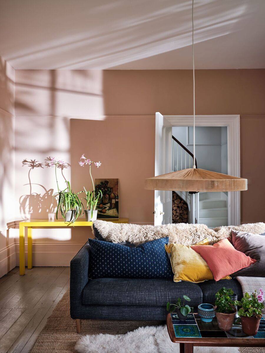
But even with a paler colour, Lorraine emphasises the importance of not overlooking the undertone.
“The biggest mistake we see is the undertone of paint being wrong. It sets the feeling for the room and is the main deciding factor when it comes to picking a colour.
"If you choose to brighten your room with a beautiful pale shade, the undertone becomes the mood for that room. If you have a naturally dark room and you choose a colour with a blue undertone, you are creating a cold atmosphere in the space. If you maybe opted for something with a brown or green undertone it would create a slightly warmer feeling.”
Trends, we know, can tempt us into imitation, but sometimes they’re not suitable for how we live, according to Patrick O’Donnell, brand ambassador for Farrow & Ball. “Every house needs moments of calm, a quieter place where the volume of design decisions is dialled down a bit. This is where paler colours — anything but bland — come into their own.”
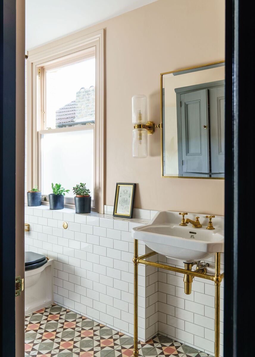
He, too, stresses how undertones impact the effect of colour, even in off-whites and neutrals.
“Our classic muted pink Setting Plaster is a great all-rounder,” he says, “bleaching out to a nuanced neutral in full sun and adding gentle warmth in a north-facing room. Something easy to live with, and layered with all the other room elements such as fabrics and pictures, are the flexible duo of Jitney and Stony Ground; enough character as not to appear bland but flexible enough to throw anything at.”
Katie Walker, colour expert
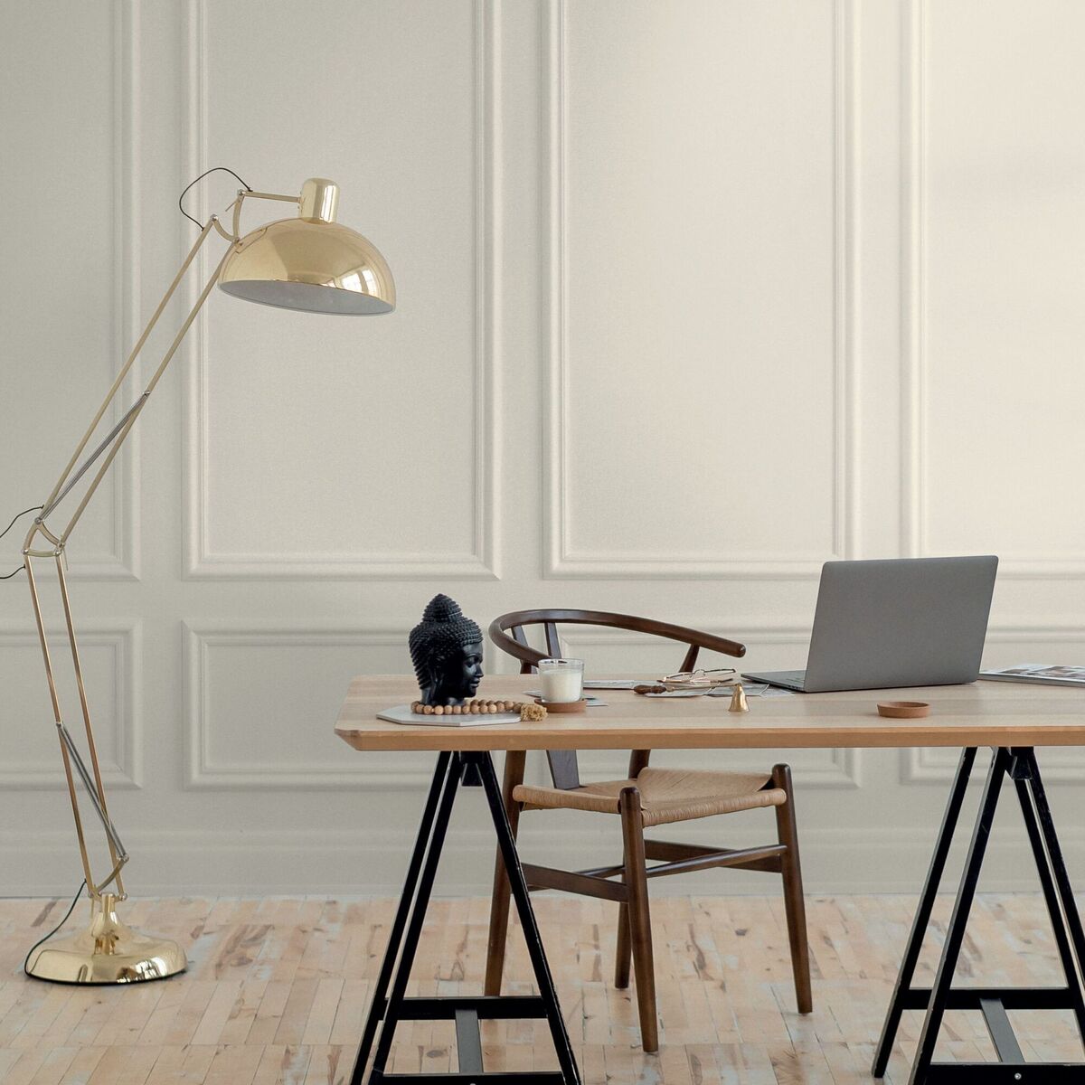
, is also getting onboard with paler hues citing them as a design powerhouse.
“From soft pinks to powder blues, the popularity of lighter shades is soaring, creating serene and bright homes,” she says. “Amidst the hustle of modern life, the trend leans toward calm and retreat-like spaces.
"Dairy Parlour, a delicate white with pink undertones introduces a trending pink while maintaining a soft, inviting aesthetic. When paired with natural textures and rich fabrics, these hues transform spaces into cosy retreats. Barely-there pastels or soft, milky tones are perfect for creating bright, welcoming hallways and tranquil living rooms and bedrooms.”
Lighter colours also influence our sense of spatial awareness, according to Acres Hall colour consultant Leah Llewellyn.
“You will immediately sense greater space and brightness in the room as the light-reflecting properties in brighter colours work to widen and expand the space,” she says. “This is what many of us crave in the New Year and the 2024 trend of moving to brighter tones captures this perfectly.
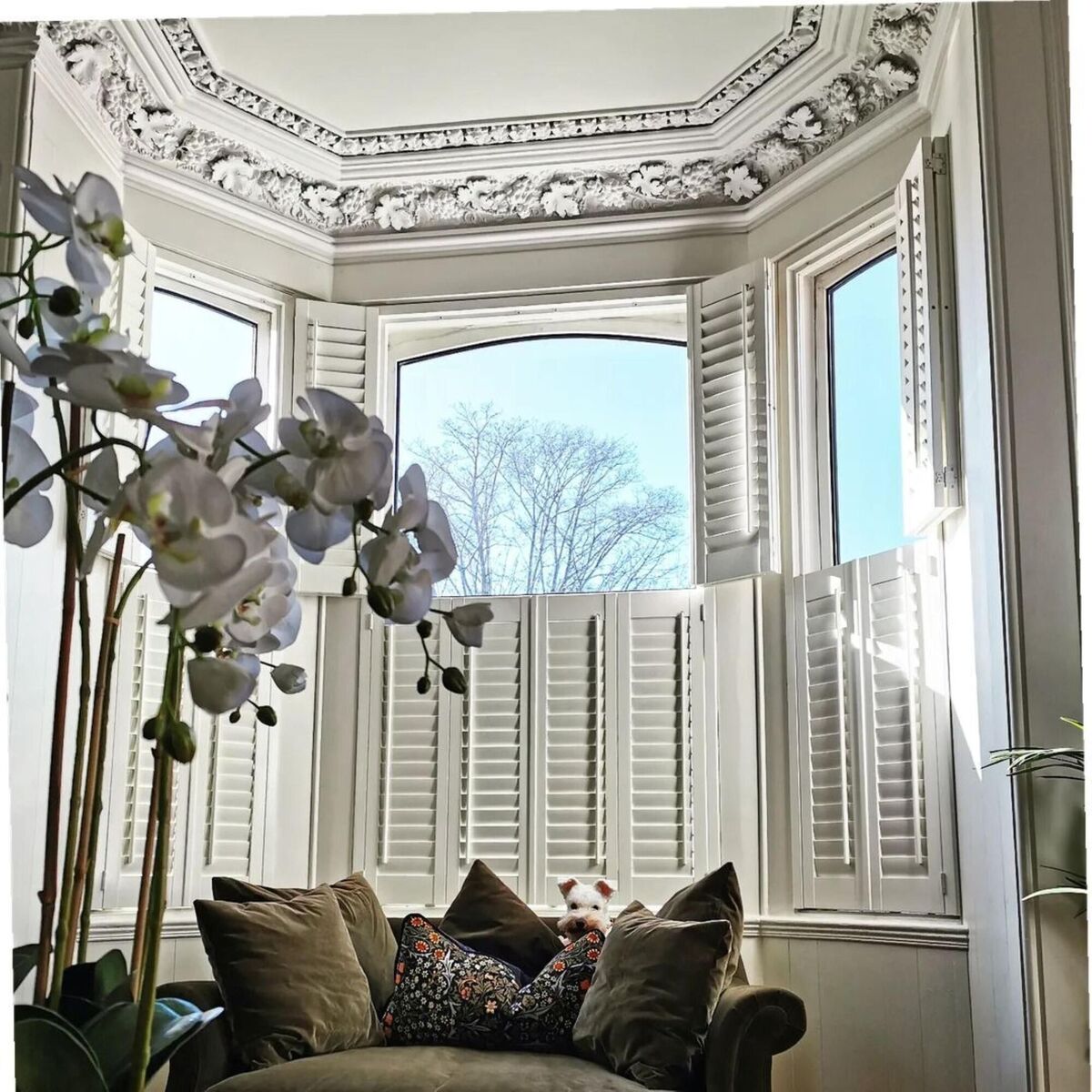
"Pale and neutral shades are versatile, timeless and effortlessly chic, and provide the perfect blank canvas on which to build your style.”
Just in case you have ever slathered on magnolia in the interests of economy and paid for it when sunlight turned it a drab yellow, Leah suggests getting your neutrals right with Classical White or Ballycowan Bán which, she says: “Work fantastically in brighter spaces as they are both cooler-toned whites but with an added softness which brings richness and depth.
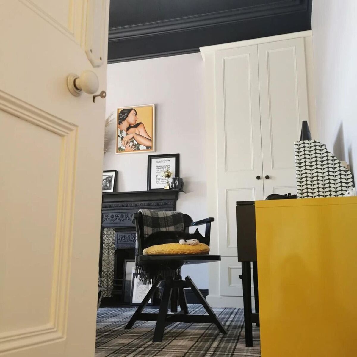
"If a pale neutral is more your style, Stonleigh or Clay Bowl from the Acres Hall are stunning neutrals with a subtle grey undertone that will complement virtually any setting.”
And here’s another value to paler hues we might not have considered: Longevity.
“We see more customers opting for a quality product in pared-back neutral shades that will stand the test of time,” Leah says. “This allows them the freedom to express their personality and style through furniture and accessories.”
- Instagram - paddy_od_1
- Instagram - lmdecor_cork
- Instagram - acres_hall


