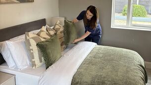
Why are we afraid of bold and dark colours for our homes?
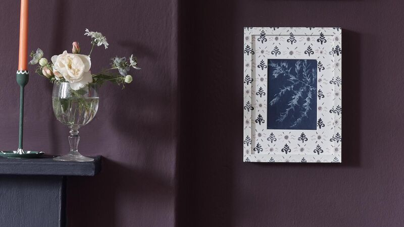
Making the case for a brave return to colour confidence
Why are we afraid of bold and dark colours for our homes?

When did we surrender all colour confidence, Kya deLongchamps asks.

THERE are many colours out there healing our post-Covid souls with nature’s gentle balm. Step forward “Wild Wonder” — Dulux’s Colour of the Year 2023, embracing shades of “straw, wheat, mushroom, and wood”.

I am a Dulux fan and Wild Wonder has so much fabulous potential — dopamine decor at its best. Watch this space to see how it will be used to optimum effect in 2023.

Of course, lighter hues can also be paired with other colours because we must allow plenty of room for the deep, the dramatic, and the slightly edgy end of the charts.

And this brings me to one of my concerns at the moment: When did we surrender all colour confidence? The Victorians, the Georgians, even the Romans would not have stood for it.

Abigail Ahern handles blue in this fathom-deep tone-on-tone treatment taken from floor to ceiling and run over every surface.

Don’t be afraid of the bold, darker colour as an alternative, or at least a foil, to lighter shades. If you order one book from your library, make it Abigail Ahern’s jaw dropping Colour (ISBN: 1849495815, Quadrille). It’s a few years old, but her energising flights into fathom-deep schemes have not dated.

Sumptuously illustrated by Graham Atkins-Hughes, in her home and buildings across the globe, Colour is a wake-up call to anyone reaching obediently for pink-based beiges or dilute, rain greys.

Unconventional and inspiring, Ahern rails against “non-colours” and recalls the heritage colours that first fascinated her. “I remember from a young age, ox-blood on the walls in the living room, a forest green dining room, accents of blues and purples, black floor: rich, often chalky finishes that off-set my mother’s painting beautifully.” Celebrating schemes worthy of a Technicolor musical, she goes on - ”When I put the key in the door at the end of a long day, I get this squishy feeling of contentment that envelopes me, and it is all because of colour.” She famously advocates for the practice of including ceilings and even window frames in a one colour palette.


Like many designers, Ahern argues that intense, jewel-toned, vivid colour (often thrown against cavernous dark walls), is far cooler and chic than constrained vapid neutrals based on stone, sand and scudding clouds. 

Wood-panelled walls are warm, reassuring and allow you to reinvent with colour applications in the future. Interior by Habitat AW collection 2022

Now paint becomes the statement, a full decorative element rather than a mealy backdrop. Seeing these colour choices as part of a maximalist approach that reduces rooms to a more relaxing state, Ahern favours emerald greens, royal blues and the many shades possible with black. To see just this kind of brave staging of the dark stuff, tap out #styleitdark on Instagram.

 2.	Annie Sloan - Living Room - Wall Paint in Tyrian Plum Satin Paint in Oxford Navy selection of Chalk Paint. Ä70 for 2.5l emulsion, chalk paint from Ä35 per litre. Online suppliers include twentysix.ie
2. Annie Sloan - Living Room - Wall Paint in Tyrian Plum Satin Paint in Oxford Navy selection of Chalk Paint. Ä70 for 2.5l emulsion, chalk paint from Ä35 per litre. Online suppliers include twentysix.ie

Period or contemporary, there are a few key tips surrounding the use of full-on saturated colour, to grasp before you plunge into a full-on Gothic drama. Ensure you’re heading for an inspiring comforting finish, cloaking in beautiful shades you can live with as contentedly as you could with the pale, expected neutrals bowing the shelves at the DIY outlets. Think of the magical world at the bottom of a sapphire lake, metallic fish flashing by. At least some of your spaces can be that entrancing.

Dark but far from dreary, wallpaper with a deep ground colour can be balanced against white or neutral walls. Hollyhocks from Sandersons in Copper/Rhodera. €142 per roll, wallpaperdirect.com

First of all, in general, starting with paint, a matt colour will not only show off a dark colour to its best, but it will hide imperfections in your plasterwork that could be showcased rudely in a mid-sheen. Today’s scrub-friendly mattes, mean you won’t leave a tell-tale change in texture if your toddler overhands a banana yoghurt onto the chalkboard emulsion.

Test both finish types on your worst wall before you start and where needed prep’ the walls – filling, sanding and using a fault-perfecting primer to the surface. Test on every aspect, as a pigment-rich shade will be muscled around by natural and artificial light more than a limp choice. With the curtains drawn, let shadows appear rather than chasing them out – in many cases intriguing shadow softens sharp corners and amp’ up a genuinely intimate atmosphere. With wallpapers, try designs where the dark ground balances anything applied over it, making its moody magnificence truly present. Oddly, dark, deep background colour delivers a hushed, receptive canvas for fabulous colour, patterns and textures on textiles and furnishings.

Working on a mood board (an exploded cardboard box can give you a generous surface) - cover a large area in your chosen shades roughly in the ratio it will take up in the overall scheme. Think about where your highlights and shine will come from. This could be a complimentary pale, a belting in white woodwork, or metallic inclusions in your accessorising. There should be an accenting gleam stirred in there, or dark could add up to down-right, light-devouring depressing. Once you layer on mirrors, velvets, wood, linen and furnishing patterns, dark backdrops will be considerably opened, so hold your nerve. Abigail Ahern advocates for including sample colours that “scare you”, boosting your confidence by starting with even a single piece of bold-coloured furniture.

Tonal grey table-scapes welcome autumn feasting with 70s flair. House Doctor Dinner Plate ware from €14.50, vivalagoon.com

Dark colours will bring the walls towards you, and if you entirely “cloak” the room in opulent colours including skirting and ceilings, this can be powerful stuff. What we want to avoid is a one-tone note of oppressive gloom. Work with your paint/paper supplier’s in-house team or an interior designer to find the right shades and colour combination to tease the proportions and to show off the architecture effectively. Contrary to the jaded advice of years ago, small spaces like cloakrooms, tiny bedrooms and snug officer quarters where you hide from the kids, can take a dark enveloping scheme, including deliberately, fussy wallpaper, even if it’s just to one or two feature walls. Stick to three hues – less visually complicated.

Other books by Abigail Ahern including her luxuriant - Everything, A Maximalist Style Guide (Quadrille) and it can be found (signed) from €36 at abigailahern.com

More in this section

Revoiced

Newsletter

Sign up to the best reads of the week from irishexaminer.com selected just for you.

Cookie Policy Privacy Policy Brand Safety FAQ Help Contact Us Terms and Conditions

© Examiner Echo Group Limited