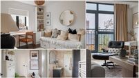
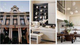
Flirting with pink interiors can help lighten your home
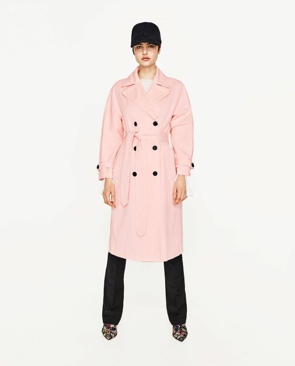
Even if you don’t wear pink, there are so many facets to this rosy hue that if styled correctly (much like that pink Zara trench coat that’s flying off the rails), it can lighten the home without leaving it looking like a Disney-esq doll’s house.
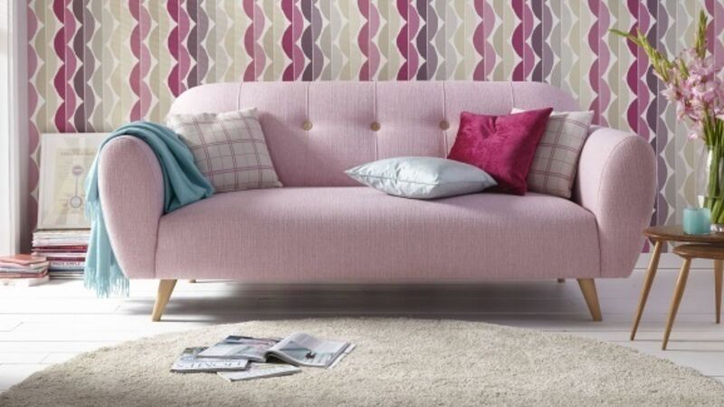
The secret is to blend, blend, blend... A ballet-slipper sofa, a sugar-almond cushion and a coat of pale pink gloss can be designed to shape, colour and contour, and be as flattering as your favourite blush.
“If you’re looking to bring pink into your palette, ensure you pick your shades carefully. Avoid overpowering a room with saccharine hues, and opt for more mature tones, that will add a feminine touch without looking too girly.
“Deep dusky pinks are right on trend and will work perfectly for a look such as this,” says Ian Dykes, founder and director, Voyage Decoration.
“If you’re opting for brighter shades, introduce them in small pops on accessories, or through accent detailing such as piping. Placed alongside masculine colours, such as deep navy blues or moody greys, your scheme will be beautifully balanced and seriously stylish.”
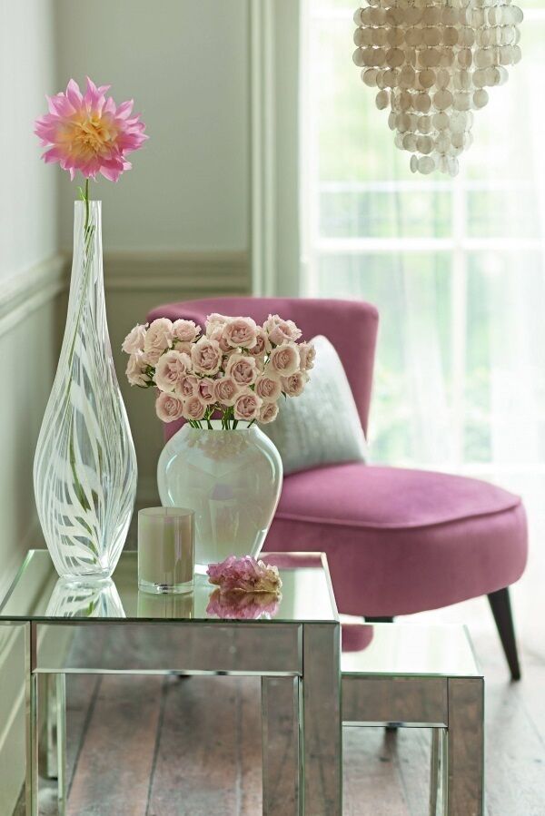
Another trick is to remember that when pink is combined with white - roses in a white vase, or scented candles on a mirrored table, for instance — it can look cool and glamorous.
“As we enter into the summer months, pink continues to be one of the biggest colour trends of the year,” says Philip Watkin, DFS design director.
“It’s a lot more versatile than you first might think and can be used in a variety of ways. We’ve used pink fabrics on our furniture to create a contemporary and soft environment in the home. Paired with on-trend metallic, especially copper, clean white walls and touches of grey, pink- blush or even bolder fuchsia tones — will create a calm yet vibrant living space.”
When it comes to updating our favourite rooms, some of us go to great lengths to shop the latest looks. And if your last dalliance was with 50 shades of grey (or darker), then the good news is you can rekindle that flame with an innocent petal pink.
“Adding colour such as pink to a room is an easy way to update the feel of the space,” says Lucy Ackroyd, bed linen design manager, Christy. “Our Harlow bed linen uses a classic design of large-scale flowers, digitally printed in elegant grey and pink tones. Mixing grey and pink is a popular trend for 2017, giving pink an edgier look than traditionally seen.”
But if this still sounds a little too innocent and you’re after a touch more drama, pink framed by violet or black is a tempting scheme that can be dressed up to suit your space.
When it comes to pink fabrics, we often associate it with lightweight, delicate materials, like silk. So what could be lovelier (and more practical) than introducing the shade to a scheme with items that are also strong and sturdy?
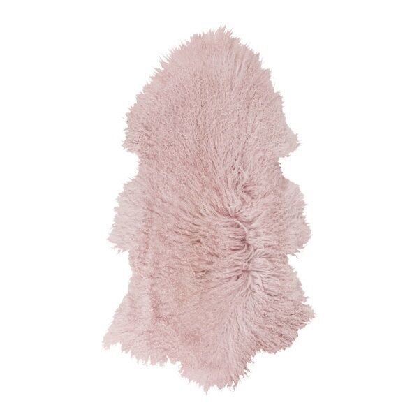
Thankfully, designers are going full-on rose this season and weaving it into heavier furnishings, with wools and rugs popping up in pink, adding texture to the ‘livingscape’ and looking blooming marvellous.
Want to go whole hog and paint your walls pink? Taking the leap can be as panic-inducing as it is exciting — especially if it doesn’t result in the photo finish you were hoping for.
So you don’t get it wrong, think about the direction your room faces and how it looks when the sun shines: “Pale pink looks best in a room with abundant natural light— showing off a sense of freshness”, says Kayleigh-Ann Whybrow, senior technical colour consultant, Johnstone’s Paints.
“Team Rosebud, a particularly popular colour this year, with white trim and furniture, to allow a good sense of proportion and freshness, yet retain a sense of warmth and cosiness. Add coral, bubble-gum pink and cyan to give interest.
“Undemanding and subtle colours, like soft and blush pinks, are emerging in ‘dirtied’ and toned down versions of their former fresh counterparts, showing off the colour’s versatility,” Whybrow adds.
“Combine a soft pink with a slightly deeper, greyer pink and a chalky, stormy blue-grey. The softer, more feminine side of the colour palette creates great contrast with the edgy blue-grey — offering a calm and soothing counterpoint.
“Keeping pattern and contrast minimal invites our mind to rest, and to find a new balance between fast paced and slow living.”
Johnstone’s Paint One Coat Matt Emulsion in Rosebud, seen above, is available from DIY stores nationwide..


