Pink Please
While huddling at home on stormy evenings, think about a spring decorating project inspired by new colour trends â relaxation and how to achieve it is a key theme.
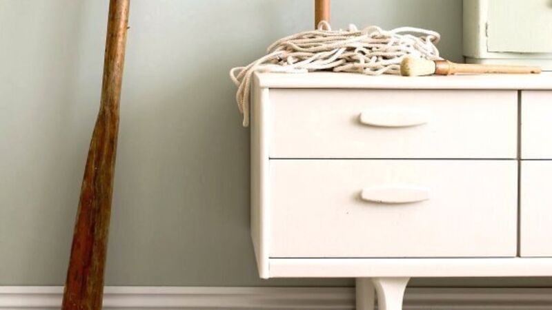
Pastels are in for 2015, and while weâd normally associate them with nurseries, this yearâs approach gives them edge while harmonising and sometimes contrasting with your overall room design.
Colour consultant for Crown Paints, Judy Smith, says: âItâs youthful and fun, using chalky, soft tones throughout; incorporating angular shapes to your design with unexpected materials such as concrete or steel giving an added modern twist to these âso sweetâ pastelsâ.
Layering, it seems, is key and helps create a modern and relaxing space.
âColours can be combined with modern furniture and hard edge materials to give an interesting mix of soft and hard that is surprisingly sophisticated,â says Judy.
Choosing colour based on your personal preferences might catch your eye but may not create the right atmosphere in the space, so start by considering the feeling you want to create and then choose new colours to suit.
Be adventurous and try colour where you hadnât previously thought to do so. It doesnât mean the result will be overly dramatic â- just different.
âDarker colours look fantastic in rooms lacking natural light,â says Sarah Cole, director of Farrow & Ball. âThey work really well on skirting boards to ground a room.â
But itâs not all about dark shades used in isolation. Too much of this can actually have the opposite effect to the one intended and create a look that is oppressive and likely to drown out natural light.
âBright shades are being used on furniture to add accents of vibrancy to spaces,â says Sarah. â2015âs key colours reflect a desire for spaces that offer escapism and a place to relax and unwind, with an earthy, natural look and feel, helping to create interiors that live and breathe.â

One of the most interesting and accessible colour looks for the coming year has been labelled âHis & Herâ by Dulux, which colour consultant Louise Tod describes as celebrating differences.
âThis look is subtle and sophisticated with a mature palette that represents the masculine and feminine point of view,â says Louise. âAll of these colours sit beautifully together so can be blended into the perfect unisex space.â
This amounts to combining hues of damson, powder pink and cream with more masculine khaki, teal and slate grey in shared spaces.
âBedrooms are such a personal spaceâ, says Louise, âthat itâs often difficult to create a look that both sides of a couple will feel at home with. This is the perfect palette to resolve those arguments and create a sanctuary for him and her.â
Overall, decorating projects are set to extend beyond the slapping of clean, fresh paint on walls, to being more considered, adding in contrasting materials for a new, but cohesive look. Copper, for instance, is the material of 2015 and a perfect companion to any of the yearâs colour looks.
* Next week weâre going to the sales to buy a sofa.