Colour it

IT seems a little early in the year to talk about orange, that zingy colour we associate with golden autumn days and the horror of Halloween. But when a colour appears on the fashion catwalk, as orange has this season, it’s only a matter of months or even weeks before the influence slips into interiors.
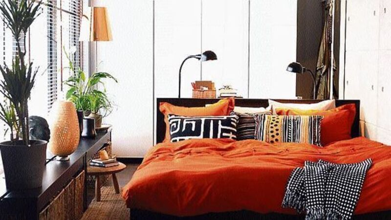
To use orange successfully, you may need to deploy the more muted grapefruit versions and tones of the colour, which means darker versions of it. Also think about tints which have white added to make them less weighty, paler and a more appropriate approach to smaller spaces, especially if you’re considering a decorating project. Consider peach, a much gentler version of orange and easier on the eye than tangerine or terracotta, so beloved by the first glut of ‘90s home makeover programmes.
Yes, indeed, orange can blind us with its dazzle and force a mental positioning of it at the bottom of our colour chart as we head into summer, a time when its warming properties may not marry so well with our anticipation of balmy weather, and when tints of blue and green and gleaming white seem more appropriate. But if you fancy giving it a go consider using it in the detail, and dim the dazzle with tinted versions such as peach and those veering into the fleshy toned world of coral.
Blending with other colours has always helped to calm down orange but the 1950s approach of orange and dark brown might best be confined nowadays to sweet chocolate confections where the union of the two is a tasty marriage. A new and more lightsome approach is to take the colour and blend its warm lusciousness with flat grey or darker charcoal to cool it down. Even the taupe end of brown can dilute the overall effect and make a very modern and gorgeous pairing.
Followers of feng shui maintain orange is less stimulating than red and so is considered a good colour for bedrooms as it’s believed to strengthen relationships. Its suggested for spaces where people congregate to decrease hostility and irritability and promote good social behaviour, and — you have been warned — promote fertility.
More adventurous souls might opt for the calming purity of white furniture to contrast with zesty orange. Take the contrast a step further with the syncretism of pagan orange and ecclesiastical purple which makes a surprisingly successful communion of colour.
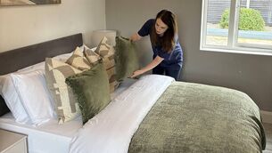
For a less deep and long-term approach to orange in your interiors, pillows and cushions are a low-commitment way to introduce it. Consider for a moment if you’re struggling to change the character of a room full of dark furniture and finished in cream painted walls. The perfect middle man to bring the two together is the accessory. Colour isn’t just about the look, it evokes a feeling too.
* Next week we’re off to London to visit international craft show Collect.


