The changing of a company’s logo is catnip to the Rage-erati

I remember when AIB changed theirs in 1990. There was hostility towards the one they picked to replace it. “What did they have to go changing that grand logo for?” said everyone. The new one, depicted a representation of Noah’s ark from a carving on a Celtic cross in Co Meath. But it didn’t matter how many times I was told that.
Once I got it into my head that it looked like an angry alien queen with a bird in her hair that’s all I saw. And the old one was a lovely triskel that looked a bit BMWish, so that you felt a bit wealthy putting your Confirmation money in there.
In 1996 Aer Lingus had a revamp. They took their shamrock and just slanted it slightly and we went spare again. We gave short shrift to any brand experts that claimed that Aer Lingus’s new slanty shamrock implied it was a company that was on the move. Especially as at the time they seemed to be so paralysed with industrial disputes with the hardy lads at TEAM Aer Lingus, the new logo looked like it was actually a shamrock leaning against a wall on a work-to-rule.
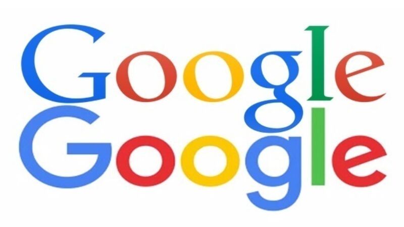
A couple of weeks ago Google took the serifs off the end of their letters. The serif is the little line at the end of letters. Serifs come from Roman times when people carving into stone put little ticks on the edge to make the ends of the letter neater. So when someone says a decision is “not set in stone” ask them what typeface they are using first (if you’re feeling particularly smart-arsey). There was a bit of kerfuffle over the Google change but not much uproar. We’re getting to a time now where people won’t be too critical of Google as they literally know where you live.
Last week, Eircom changed their name to Eir and they released a squiggly little logo to go with it. You’ll see it soon on the front of your phone bill and you’ll nearly throw the phone bill away because you’ll think the letter is from a company trying to sell you hygiene products that “keep you fresh all day, whatever the time of month”. But don’t throw the bill away. Instead look at it in detail just in case you are still being charged for a cordless phone that broke four years ago.
The changing of a company’s logo is catnip to the Rage-erati who suspect that in a world where con-artists abound, the words kind of bounders are the artists who make logos.
“I could do that meself” will be the refrain from the man on the street but, unless he’s a graphic designer, he’s wrong. He couldn’t do that himself. If you want an idea of what logos would look like if every company said: “shur we could do that ourselves and save a pot of money” imagine if every company’s logo looked like the homemade signs they have on Winning Streak.
And don’t worry you’ll get used to it. Every brand change raises a fuss and we get on with our lives. Even when places are renamed, we get used to it. The Aviva stadium was sacrilege at the time, now it’s become common parlance. If Croke Park became the Denis O’Brien IN YOUR FACE Arena it would take a while but gradually we’d come to terms with it.
I’m now rebranding myself. The logo is still with the graphic designers, but I want a new name that better reflects my commitment to constant improvement as well as my goal to have a presence all across the country — COLMINATION. What do you think? It’s brand-new.


