8 times rebranding didn't go down well with consumers
It is a bombshell that has shocked the world and provoked heated exchanges on social media. How could such an irresponsible decision be taken so lightly? What will be the long-term ramifications? Has our way of life been permanently undermined?
We of course refer to the announcement that the manufacturer of the Toblerone chocolate bar has changed the design of the popular confectionary. In a cost-cutting response to Brexit, Mondelez International has increased the âspaceâ between those iconic ridges, thus reducing overheads (inevitably Irish consumers will have to make peace with the reconstituted treats too).

The backlash has been instantaneous and deafening â a proper âTobler-moanâ, to quote one British tabloid. âLike many other companies, we are experiencing higher costs for numerous ingredients,â said a spokesperson for Swiss-headquartered Mondelez. âWe carry these costs for as long as possible, but to ensure Toblerone remains on-shelf, is affordable and retains the triangular shape, we have had to reduce the weight of just two of our bars in the UK, from the wider range of available Toblerone products.â Itâs too early to predict whether the changes will impact on sales of Toblerone in Ireland. However, if previous cases of corporations tinkering with beloved brands offer any clue, consumers may vote with their wallets.

The tangerine-derived soft drink has been a favourite in Cork for decades, having been introduced to the market in the â50s. So there was predictable outrage when, in 2011, Tanora was reformulated by Coca Cola, prompting an instant pushback from consumers. In short order, the ânewâ Tanora was withdrawn and the packaging on bottles amended to make it clear the beverage within was the âoriginal formulaâ. Thus was a national tragedy narrowly averted.
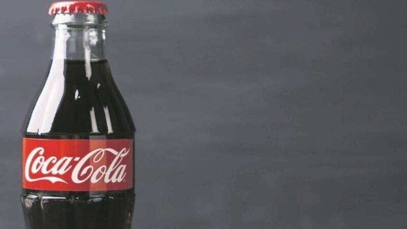
The âmarketing blunder of the centuryâ saw Coca Cola replacing its decades-old formula in 1985 with a much hyped âNew Cokeâ. This was in an attempt to stymie Pepsi, then challenging Cokeâs dominance of the cola market. But the public was not happy â with protests across the United States (where they take their fizzy beverages seriously) and a man in Texas even stocking up on $1,000 of of âoldâ Coke in preparation for the soft drink dystopia that loomed. Within three months, Coke had relented, restoring both the original formula and traditional branding.
Hoping to shake up its sleepy brand in 1997 the UK flagship airline replaced its traditional Union Jack tail designs with âfunkyâ creations inspired by Britainâs Commonwealth connections.

âPerhaps we need to lose some of our old-fashioned Britishness and take on board some of the new British traits,â said chief executive Bob Ayling, who, it is tempting to conclude, had inhaled the âCool Britanniaâ vapours swirling around the UK at the time.
But neither passengers or crew warmed to the new look and, with the departure of Ayling in 2001, the trail-fins were repainted with the original flag motif

Just as it was remaking itself as a global television force, Netflix very nearly shot itself in the foot. In 2011, the company split its streaming service and its older DVD rental business into two companies, with the latter rechristened â Qwiksterâ. Subscribers were aghast â within months, Netflix was just Netflix again.
Though rarer in Ireland than a Donald Trump supporter, in Australia Vegemite is a national institution. Which is why the decision in 2009 to rechristen the sniffy spread âiSnack 2.0â prompted outrage and disbelief. The intention was apparently to borrow some of the aura Apple had cultivated with its iPod and iMac brands. But what had a cheap and cheerful splicing of brewersâ yeast extract and vegetable and spice additives to do with Silicon Valley? Very little and food giant Kraft was quick to reverse course.

The name might not be glamorous but at least everyone had a basic understanding of what the UKâs Royal Mail was about. However, in 2002 the company, keen to communicate that its activities went beyond the core business of delivering letters, rebranded as âConsigniaâ. âThe Consignia name has become a stick for the media to beat the group with. It wonât escape until the name becomes a relic of history,â an executive told Marketing Magazine. Two years later, the C word was binned.

The vogue for minimalist logos led Gap to change its iconic lettering for something more understated in 2010. General derision ensued. âThe most common sentiment [was] that it looks like something a child created using a clip-art gallery,â said AdAge magazine. The new logo lasted all of a week and the executives overseeing the reboot resigned.

Locked in a dispute with his record label, the artist then known as Prince decided radical action was required. So in 1993 âPrinceâ became âindecipherable squiggleâ and his record sales nose-dived (his increasingly iffy quality control as a songwriter may have played a part too). When his publishing contract with his label expired the singer sensibly reverted to his original moniker.