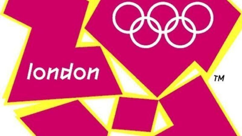
Logo branded for life

THE logo for the London 2012 Olympics was unveiled on Jun 4, 2007. It was like a bomb going off. On the streets and on web forums, there were hackneyed critiques (the kind voiced every time an Olympic logo is unfurled) — that its jagged representation of the year ‘2012’, with Olympic rings embedded in the zero, could have been cobbled together by a child.
But the vitriolic nature of the criticism caught the Olympic Committee off-guard.


