Colm O'Regan: A font of knowledge when it comes to typography
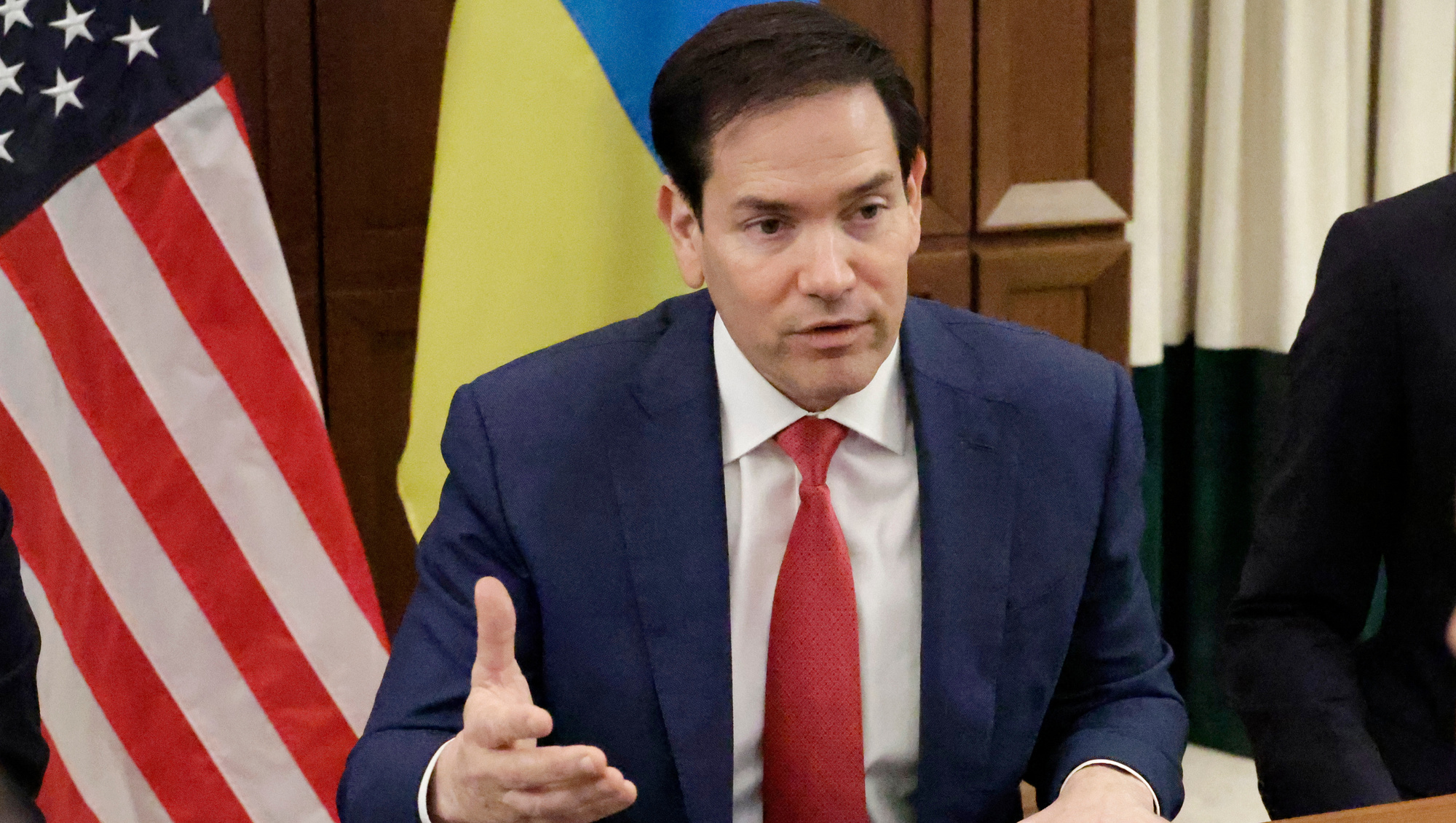
In a bid to be taken more serif-ously US Secretary of State Marco Rubio wants to ditch the Calibri typeface and use Times New Roman
US Secretary of State Marco Rubio: 'Switching to Calibri achieved nothing except the degradation of the department's correspondence.' Picture: AP/Terry Renna

US Secretary of State Marco Rubio: 'Switching to Calibri achieved nothing except the degradation of the department's correspondence.' Picture: AP/Terry Renna
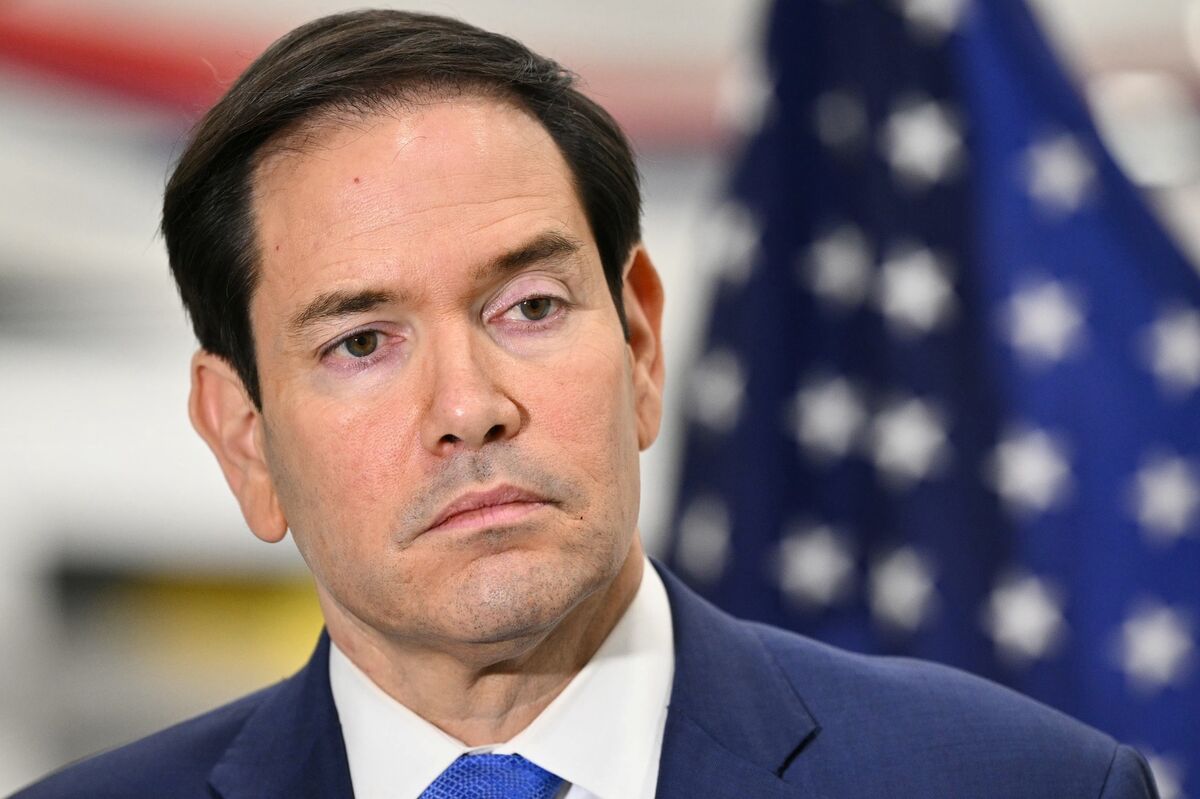
Poor oul Marco Rubio. The man used to be a real politician. Now he’s banning typefaces.

The US secretary of state is supposed to be a job where you’d negotiate on nuclear weapons treaties.

It also seems to be one where you say: ‘Although switching to Calibri was not among the department’s most illegal, immoral, radical or wasteful instances of DEI it was nonetheless cosmetic.’

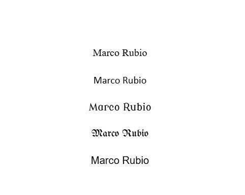
In 2023, the US government switched from Times New Roman to Calibri for its official documents. Marco is just doing a Ctrl+Z on that.

Calibri is a typeface developed for Microsoft Word in 2007 and it replaced Times New Roman as the default. You might have noticed on a new laptop, one day you started a new Word document and the default typeface looked smoother. Times New Roman was the typeface developed in the 1920s and has ‘serifs’ or edges.

Serifs may have originated in Ancient Rome when words were carved into blocks. Before something was carved it was painted onto the stone. When painting the ends of the letters they flared slightly and the carvers followed those flarings creating those edges in the marble or granite or sandstone. 

'Typography shapes how official documents are perceived in terms of cohesion, professionalism and formality,' Mr Rubio said in a cable sent to all US embassies and consulates abroad.

That’s the theory anyway. But like all theories about the past, it’s not set in stone.

The Calibri is a typeface that is sans (or without) serif. It is said to be easier to read on screens — and for people with eyesight issues it can be easier to read in general.

‘Feck those kids,’ Marco Rubio may as well have said. Calibri is ‘DEI’. And therefore dead. (DEI stands for Diversity Equality Inclusion. Like ‘woke’, it used to mean ‘maybe we should try a little human kindness’ but now apparently it means ‘A threat worse than The Plague to civilisation’). Times New Roman is rarely seen on a website... unless it’s a very old one with a view-counter and a link to purchase a CD audiobook about the true history of Jesus’s bloodline.

This seems minor, but typeface can actually be a very big deal because it ties into identity and history and tradition. Even at the country-level. For example between 1806 and 1941 there was an actual typographical dispute. (And you know what they’re like. They send threatening letters that no one reads)

The dispute was between Fraktur and Antiqua. If you were watching a movie about a fairy-tale, Antiqua would be the typeface in the Big Fairy Tale Book. Fraktur is the typeface of Nazi signs announcing evil rules against Jewish people. Antiqua was seen as non-German. Fraktur harked back to an imagined German ‘gothic’ lineage. That’s why it’s on all those Nazi signs.

US Secretary of State Marco Rubio used to be a real politician. Now he’s banning typefaces. Picture: Mandel Ngan/AP

But weirdly, Hitler hated it. He made up some sort of claim that it had elements of Jewishness in it and so it was banned. But still it ‘feels Nazi-ish’ so you might want to hold off on using it to write ‘Don’t Judge Me If You Don’t Know Me’ in a tattoo on your arm.

In less-Nazi examples, Ikea got huge world-wide backlash in 2009 when it changed the typeface of their catalogue from Futura to Verdana.

What? You didn’t know about this? What could possibly have been going on in the world in 2008/9/10 that meant you missed this?

Futura was the typeface used on a plaque left on the moon by Apollo 11 crew. It was in the famous Volkswagen printed ads of the Mad Men era. Verdana was again designed by Microsoft for the web. So obviously that was sacrilege.

Times New Roman might not be your type. But its return to US government documents reminds us that the shape of the letters we read is sometimes as important as the meaning of the words they make up.

More in this section

Lifestyle

Newsletter

Eat better, live well and stay inspired with the Irish Examiner’s food, health, entertainment, travel and lifestyle coverage. Delivered to your inbox every Friday morning.

Cookie Policy Privacy Policy Brand Safety FAQ Help Contact Us Terms and Conditions

© Examiner Echo Group Limited