Getting in gear: the good, the bad and the ugly of Euro 2024 kits

If the battle of the kits reflects the way the tournament is likely to play out, they might as well parade the trophy in Paris now.
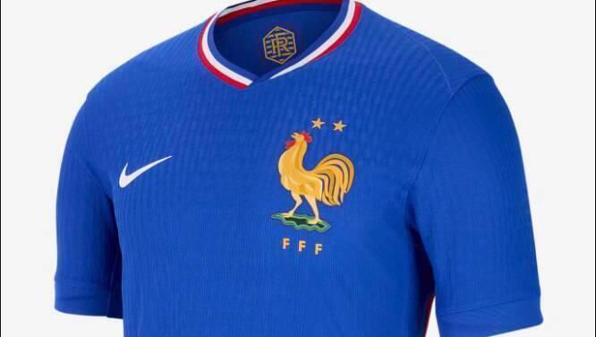
France’s pin-striped away shirt is a thing of beauty with blue and red vertical threads traced over a white background. But even that is outshone by the stunning royal blue home kit trimmed with a red white and blue neckline. And that’s before we’ve got to the oversized cockerel badge that will have supporters of a certain age weeping at the memory of Platini, Giresse and Tigana in their 1984 pomp.

It’s a fine line between being understated and dull as Romania will demonstrate when they take to the field against Ukraine on Monday.
The combination of yellow, red and blue have produced some fine kits in the past and never more than when the east Europeans dumped Kevin Keegan’s hapless England out of Euro 2000 while wearing a shirt for the ages. But this time around they have badly missed the mark with the red and blue restricted to barely visible arm trim. And to cap it all, manufacturers Joma have decided that adding a v-shaped opening to a round collar is just what the football world has been missing.
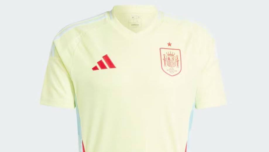
There will no doubt be people out there who will like the colour of Spain’s away kit. But leaving the designer our of this, it’s hard to avoid the feeling this shirt has the look of a gamble gone wrong. The Adidas website describes a “bold design to bring a vibrant twist to the game” which makes the insipid shade seem far more exciting than it really is. It would probably look better on a sweat-drenched, mid-nineties dancefloor than at a major tournament, but let’s be generous and say it might surprise us all under the floodlights.
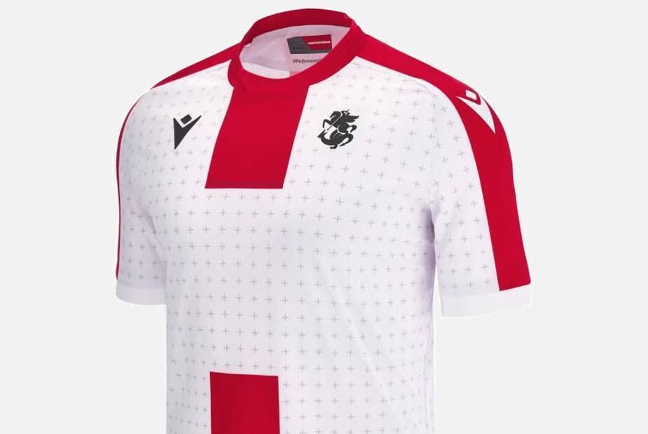
Georgia are keen to make an impression in the country’s first ever appearance in a major finals and they have followed the Croatia playbook to make sure they make their mark no matter what the outcome of their efforts to qualify from group F. The white home shirt is dotted with tiny crosses with bold red stripes down the front, back and both arms echoing the nation’s national flag. There’s a lot going on, which will surely only help star player Khvicha Kvaratskhelia’s efforts to bamboozle his opponents.
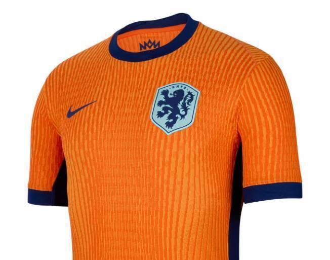
Only one colour counts when it comes to the Netherlands and there will be no mistaking Ronald Koeman’s side when they face Poland on Sunday. The clue is in the name, and this time the Oranje will be wearing a very classy offering capped off with a navy blue trim. There may not be enough bells and whistles for some, but this will definitely satisfy those who like a classic look. It will never match the iconic shirts of the seventies but squint, and you could almost see Arie Haan blasting one past Sepp Maier from 40 yards in Argentina at the 1978 World Cup.
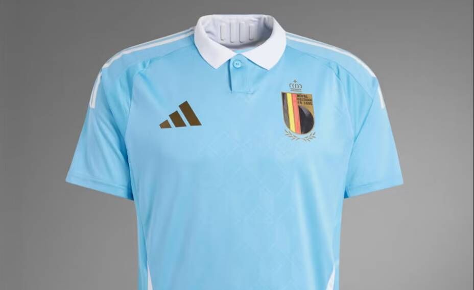
It’s a brave move to take your lead from a cartoon character when designing a kit - but Belgium have pulled off the brief magnificently with the Tintin-inspired change away strip. Who knew that a sky blue jersey with white collar, brown shorts and white socks would look so stylish? Well, anyone who has read Hergé’s books, actually. It’s just a shame they stopped short of dressing Kevin De Bruyne and co in the comic-book hero’s trademark plus-fours. It will be a bold act to follow, but no doubt another country something similar next time around - and most likely get it badly wrong.
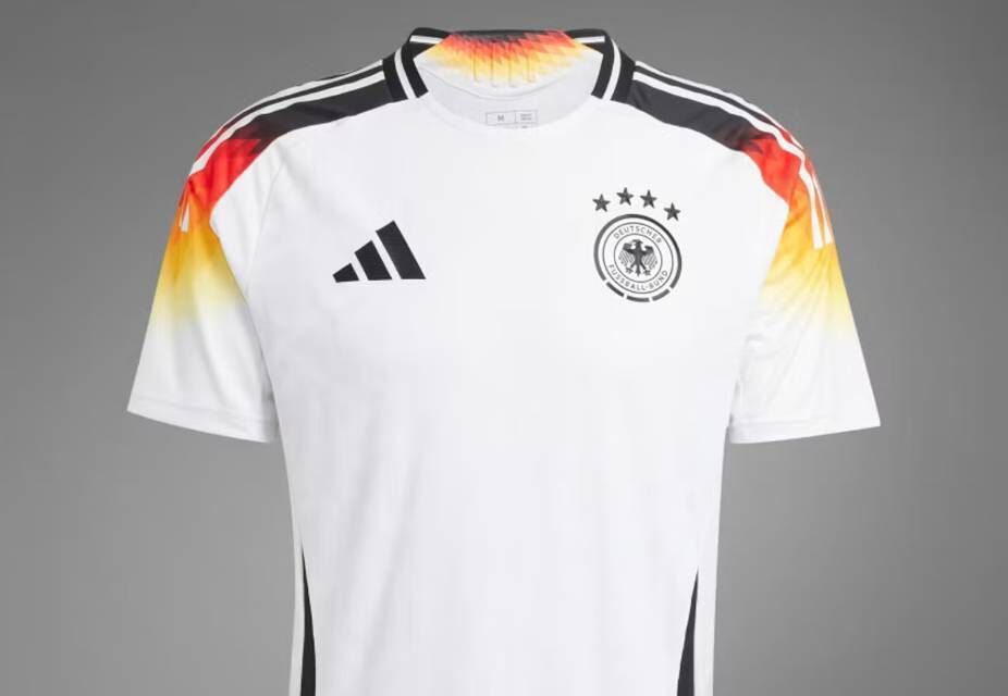
For anyone with any money left after buying both France shirts in multiple sizes as gifts for all their friends and relatives, the Germany home kit deserves a place in the wardrobe. The broad black stripe down the front of the shirt has gone, replaces with a design that includes flashes of red and yellow on the shoulders which draws a line back to the sides of the early nineties. The detail carries on around the back of the shorts, which is what unfortunate defenders charged with marking Jamal Musiala might see quite a lot of this month.

Way back in the 80's, Half Man Half Biscuit memorably (for some) sang about wanting a Dukla Prague away kit for Christmas. It’s unlikely anybody is planning to mention Slovakia’s second strip in a song’s lyrics any time soon. It may be big in Bratislava, but a largely plain white shirt is unlikely to set the pulses racing across the continent. Yes, it looks neat and understated and there is certainly a place for simplicity in a football clobber market that is saturated with over-designed monstrosities. But it’s unlikely this shirt will ever be talked about in hushed tones.
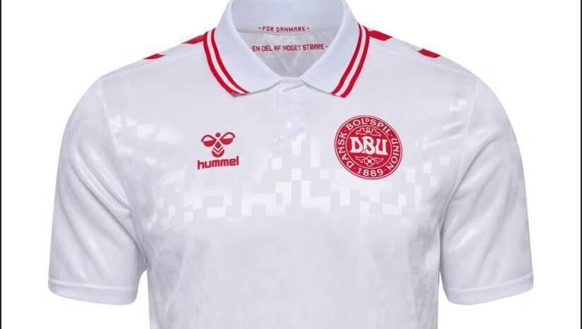
Who could possibly be offended by a crisp white shirt with red trim and a button collar? Nobody, apart from those who want a little more daring in their football shirts. Rasmus Hojlund and his teammates could wander into a local tennis club near their Freudenstadt base this month and not feel out of place. It’s the kind of thing your non-match going, elderly relative might wear if they were finally getting dragged into spirit of things after qualification from the group stages. Which is exactly what Kasper Hjulmand’s side are aiming to achieve.
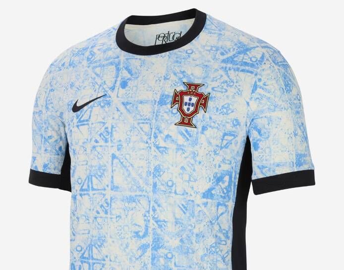
There’s nothing wrong with celebrating aspects of your national heritage but it’s a risky business transferring that onto a football shirt - especially if you are paying tribute to your country’s proud tradition of tilework. Fair play to Portugal then who have pulled off the brief magnificently with an away kit that incorporates more than a nod to the Azulejo architectural tradition. The white background with light blue pattern manages to be fussy and understated at the same time - so slightly more Bruno Fernandes than Cristiano Ronaldo.
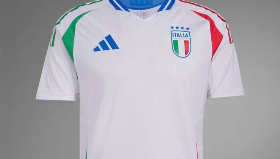
The rule is less is more when it comes to classic Italian home kits - one that has sadly been disregarded for this tournament. The away shirt though is a different matter completely. A basically white shirt runs the risk of being dull but green and red side panels give it enough of a summer feel to wear down the spiaggia this summer. Not sure how it would look with Neopolitan gelato down the front, but if Luciano Spalletti’s Azzurri can stage a repeat of their success at Wembley three years ago, is anyone going to care?
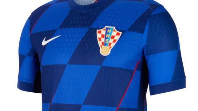
After years of producing go-to classics, Croatia have messed around with a winning formula by introducing oversized red and white squares on the home shirt. The away shirt, however, more than makes up for that misstep with a very stylish offering that wouldn’t look out of place in the bar if you’ve forgotten a change of shirt at the Tuesday night five-a-side. The trademark checks are still there - this time in different shades of blue - together with a stand-out badge giving a look that would make even Luka Modric appear a fresh-faced twenty-something. Scotland’s dark navy home kit also passes the jeans test with flying colours.


CONNECT WITH US TODAY


Be the first to know the latest news and updates


