Design team creates the colour of courage. Here's how to use it
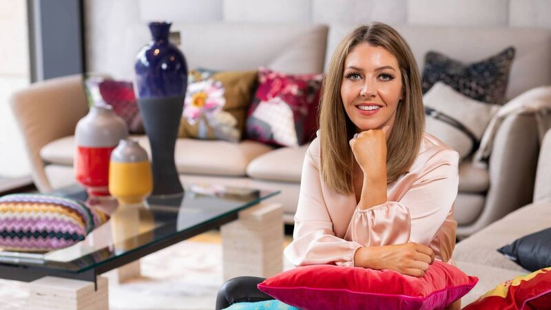
Jane Witter, Dulux Colour Hero.
Taking into account the altered world we live in, Dulux unveiled Brave Ground as its colour of the year this week.
During the big reveal, on Tuesday, Dulux described it as “a bolstering and balancing new shade that will connect us back to nature and the simple things for the year to come”.
Brave Ground is a warm, natural colour that stands on its own as a powerful neutral and can be used with pops of other colours.

So how exactly is the colour of the year selected? Well, each year a team of designers, architects, colour creatives and trend experts works alongside Dulux to forecast the following year’s chosen shade.
Brave Ground is designed to serve as a strong foundation for embracing change in the home, according to the creative director of Dulux Ireland, Marianne Shillingford. “Earthy and empowering, it evokes security, growth and potential to help us create environments that infuse us with courage,” says Marianne. “Needless to say, it’s been challenging this year to transform the key global trends into inspiring colour palettes. We’ve seen unprecedented global change, with all of us facing experiences that feel out of kilter with the world as we knew it. At the same time, many people have experienced positive things — solidarity in communities, strangers’ generosity, and the realisation that together we can do extraordinary things. People are digging deep and finding the courage to move forward.”

The past 12 months saw many use paint colour to make positive changes in their homes, adds Irish Dulux colour consultant Cora Collins. “They stretched themselves by spring-boarding outside their comfort zones to make interior changes that they may have put on the long finger in the world as we used to know it.” Brave Ground is “just like a makeup foundation”, she believes. “It’s a grounding colour that works a whole range of different palettes through which colour can be worked in, as you would with an eye-shadow palette creating a strong base for complementary colour,” says Cora.
Dulux has built four colour palettes around Brave Ground which take this neutral shade in very different directions.

Responding to specific needs, each one allows consumers to confidently express themselves with colour:
The Earth colour palette connects us to the natural world with blue, green and brown echoes of the sea, the sky and the soil — giving us the courage to adapt.
The Timeless colour palette celebrates the old and the new with yellows, ochres and soft neutrals — lending inspiration to build on the past.
The Trust colour palette brings together earth tones from across the globe to encourage collaboration and a sense of community — offering reassurance.
The Expressive colour palette stands out with shades of reds and pinks that are balanced by soft neutrals.
The pandemic has affected so many aspects of our lives and colour choice is no exception, according to Jane Witter of Dulux.
But can colour really boost our sense of wellbeing in this new work-from-home zone?

“Choose a colour or colour palette that allows you to work at your best while feeling your best,” says Jane. “It’s incredible the influence colour has on our mood so I recommend taking time to consider how certain colours make you feel. What is the impact that feeling has on you performing at home? Take a look at the four colour palettes from our (Dulux) colour of the year 2021.
“The Expressive colour palette is rich but not overpowering, these are colours that encourage creativity everywhere. The colour palette offers shades of reds and pinks that are balanced by soft neutrals.”

And as I tap away in my home office/sitting room, I wonder about the optimum way to use colour to perk up rooms like this that now never seem to cease multitasking. “Multifunctional spaces often demand unity,” says Jane. “Choosing colours that transition well between the functionality of spaces is key. A great way to choose a colour for multifunctional spaces is to use a grounding colour such as Brave Ground. It is a natural warm neutral that allows other colours to shine and provides a firm foundation for living.” As for setting the colour tone for online meetings (for those brave enough to leave the camera on)? “Before choosing a colour for that backdrop to your Zoom meeting, take care to choose a space that has good lighting,” advises Jane. “Natural lighting is your best friend. Avoid colours that are light and can look bland or washed out in your background. Instead look for strong and deep shades. Express yourself through your colour choice.

“There’s a fantastic range of colours to choose from across the colour of the year (COTY) palettes such as Stolen Rose from the Expressive palette, Brave Ground seen in all four colour palettes as the leading colour for 2021 and Night Seas from our Earth palette. Express yourself and add some design accents with an indoor plant like pampas, artwork or bookshelves with some interesting textures and colours.” Dulux Brave Ground is available from stockists through colour mixing in any finish for walls and wood. Check out www.dulux.ie/visualizer