Interior design that gives your home the feelgood factor
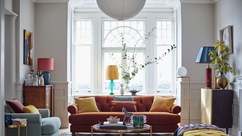
New trends are no longer defined simply by colour and style but play to all our senses  
Interior design that gives your home the feelgood factor

The Kirkton range of plush velvets in hues of semi-precious stones is a fresh look moving on from deep jewel colours of recent years.

Give me any excuse for a trip to London and I’m off.

If it involves access to hot new trends, better still, as travel is still something of a novelty after lockdown stopped plane-hopping excursions in search of interiors fodder.

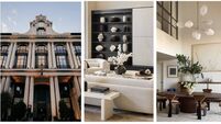
Happy to report I’m just back from soaking up inspiration for spring and summer revamping projects at the DFS Feel Good Home event at London’s Oxo Tower.

It totally played to my love of playing house, where themed room sets gave me a chance to try sofas on for size, throw myself prone on beds made with on-trend crumpled bed linen — so no upsetting the stylist — and do the touchy-feely thing with textiles.

Room sets are all-round good things in my view. For those of us in the biz, they’re bite-size access to what’s new and conveniently Instagrammable.

For homeowners, they’re a clear steer as to how a look might come together and help hone one’s own personal style, a topic I discussed at the event with Lou Petersen, head of design innovation at DFS. “I would always encourage people to unlock what they would love long-term,” she tells me. 

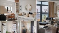
 The Nomad room theme cites world travel with earthy tones, African-style patterns and textures centred around the Grand Designs chenille Lambourn sofa.
The Nomad room theme cites world travel with earthy tones, African-style patterns and textures centred around the Grand Designs chenille Lambourn sofa.

“What fashions do you love? Use that as a pointer. Don’t follow trends as such but use what speaks to you. Are you a Sunday napper who wants to lie on the sofa? Then [choose] a cosy lounger with low arms. Choose a corner sofa if you have more people to squeeze in.”

The seven looks she’s created are based on our renewed appreciation of the important role our homes play in our health and wellbeing and I surprised my minimalist self by having a moment with a look called Velvet Twist, a sort of pared-back maximalism evolving from jewel tones to the hues of semi-precious stones. It’s delicately tactile and a touch mid-century.

 Think Hollywood girl-about-town meets modern It Girl with the Enchanted sofa in a watermelon-hued velvet.
Think Hollywood girl-about-town meets modern It Girl with the Enchanted sofa in a watermelon-hued velvet.

For fun colour lovers, a watermelon-hued sofa might prove to be the hit of the season on low-pile velvet with its more chalky finish to appeal to anyone who finds the sheen on velvet a bit OTT, although I found my natural habitat in Nature Luxe, a tranquil and muted look with earthy neutrals (we really have moved on from chilly white and cold grey) and warm metals. 

It’s a pared-back look where Lou and the team have created tactility and interest with organic curves and bouclé touches. But touch is not the only sense heightened as I wend my way around the room sets.

 Boucle is having a moment as a warm tactile fabric in the Calix accent chair in relaxing forest green contrasting with the Dwell Alba gloss and oak shelving unit.
Boucle is having a moment as a warm tactile fabric in the Calix accent chair in relaxing forest green contrasting with the Dwell Alba gloss and oak shelving unit.

Scent- and sound-scaping are layered on top. It’s the specialist topic of Pippa Jameson, sensory designer and author of The Sensory Home, who joined me on the particularly supportive Salvia outdoor sofa to chat about regulating the sensory experience of your home for that feel-good factor.

“It’s designing with emotion,” she says. “Stop and listen to the sounds in your home. What can you hear, what can you smell? What’s in your eye line where you’re sitting? Is it your desk after you’ve finished work?”

She pays special attention to the bedroom. “If you have to use it as an office by day, visually zone it by using a screen, even if you feel you’re not affected. Add scent, deep blues and greens, or warmer neutrals with undertones of pink.”

Those neutrals would certainly be my bag but I’m intrigued by Marianne Shillingford, creative director at Dulux, who tells me choosing colour is like dating.

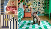
“Get beyond that first date with the tester pot,” she says as she shows me her collaboration with DFS on a bedroom that has made a commitment to emerald green and teal with honey accents. The effect is a blend of boutique hotel meets cocooning sophistication but Marianne adds that choosing colour for the bedroom is really all about the feeling you want to evoke.

 The Joules Windsor bed in yellow velvet adds glamour and colour against a neutral backdrop with tiny accents of green in accessories for contrast.
The Joules Windsor bed in yellow velvet adds glamour and colour against a neutral backdrop with tiny accents of green in accessories for contrast.

“Think about what will happen in the space,” she says. “Would you like to wake up after restful sleep or wake energised?

Clearly we don’t all have the skill and confidence with colour that the creative director of a paint company has, but she has a guiding principle.

“Pick colours from the same family, colours that are familiar tonally or harmoniously, and remember that dark advances, making a wall seem closer, and light recedes. Don’t decorate for anyone other than yourself. Paint the feeling that makes you happy and gives you what you need.”

More in this section

Revoiced

Newsletter

Sign up to the best reads of the week from irishexaminer.com selected just for you.

Cookie Policy Privacy Policy Brand Safety FAQ Help Contact Us Terms and Conditions

© Examiner Echo Group Limited