The new colours of the year - and how they influence our behaviour
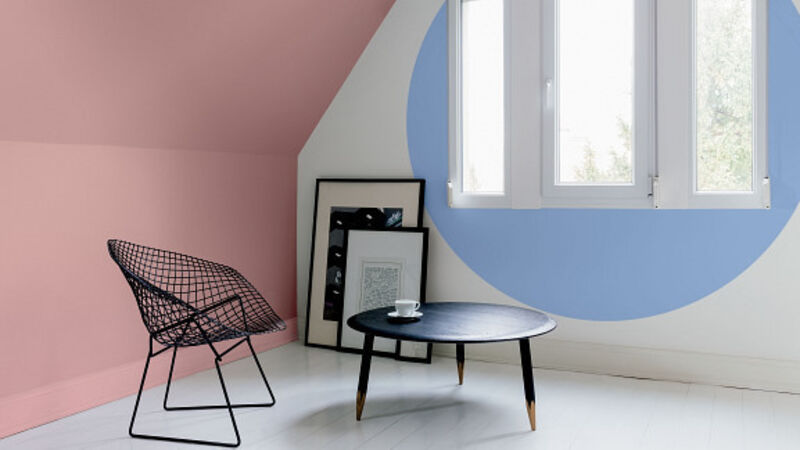
By the time you’ve finished reading this, you may look at a match between Cork and Kilkenny from a new perspective.
Red is associated with success; yellow and black with things to fear — like wasps and tigers.
This is something known by colour psychologists for a long time and it’s been employed by big brands to influence our buying decisions for decades.
“Think of how many famous fast food outlets use high energy, appetite stimulating reds in their logos,” says Adele Roche, a colour consultant with a special interest in colour psychology for Colortrend.
“Whereas high-end restaurants use calmer colours to keep customer sitting buying more wine.”
But it seems our knowledge of colour and how it impacts on us, especially in our homes, is sorely lacking.
“Ask most people what’s their least favourite colour and they’ll say yellow,” says Adele.
“Yet our favourite neutrals continue to be cream and magnolia which both come from yellow.”
As a simple guideline when making colour choices, she says: “Red and pink are warm colours and so is orange. Blue, green, and lilac are cool.”
Bear this in mind if you have a decorating project in the planning, especially as international colour authority Pantone, which decides on the Colour of the Year, has decreed two colours for 2016: Pink and blue.
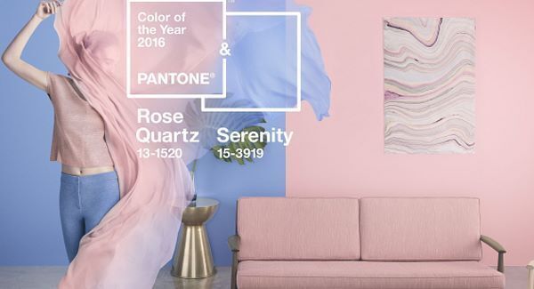
Going by the respective names of Rose Quartz and Serenity, they couldn’t be further from Masala, the intense and saturated colour of 2015 which we might have used as an accent but were unlikely to slather on the walls of an entire room.
“These colours are calming compared to Masala,” says Adele.
“Blue is great when you need to relax but it’s also regarded as an appetite suppressant so pink is better where you’re eating.”
For most home decorators, blue in all its shades and hues is a popular choice, being the world’s favourite colour.
Pink on the other hand, is slightly challenging because of its association with little girls’ bedrooms, making it a reluctant choice for grown-ups.
Adele suggests using it with grey which in its palest hue has become a neutral, of late.
After that, the next important step is handling the practicalities.
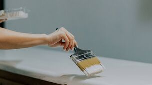
Her advice is to get paint sample pots or swatches, but it isn’t enough to just to swipe the paint across a single wall.
“When you’re choosing paint colours, understand the light in your house,” she says. “It’s going to be different in a shop than in your home.”
She also suggests placing a swatch or dab of paint in at least three different places.
“Don’t just do it on the largest wall away from other colours. Do it near your upholstery and drapery to see how they work together.”
Farrow & Ball, famous for its chic, flat paint colours, is adding light airy green and warm brown to work with its versions of the Colours of the Year which are named Pink Ground and Light Blue.
The company’s head of creative, Charlotte Cosby, says: “Over the last 12 months we’ve seen a definite move towards people embracing softer, delicate colours that help to turn our homes into spaces that offer escapism from our increasingly nomadic working lives.”
Farrow & Ball’s version are paler in appearance than Pantone’s, so for depth, Charlotte suggests combining Light Blue with blackish-grey in your colour scheme.
Her approach to pink counteracts any fears of the outcome being sweet and sugary by focussing on softer versions which exude sophistication in typical Farrow & Ball fashion.
“Light blue works exceptionally well in large rooms with lots of natural light and will help to create a sense of tranquillity,” she says.
“My bedroom or bathroom are two places I would look at using it, and in my hallway to create a light and spacious entrance. But we would advise against using it in a north facing room as it may appear slightly cooler.”
Pink has to be handled differently because of its long association with femininity, but Charlotte has an essential tip for its success.
“It can be used in most rooms to great effect, as long as it’s used in the right way with a complementary colour scheme.
Pink Ground is a warming colour and it works very well in bedrooms and living rooms for a cosy atmosphere.”
January 2: Caliology and Lineage, an exhibition of functional art.
There’s opportunity for creativity everywhere.
So Christmas cracker hats off to the Irish Examiner’s digital desk for building a Christmas tree out of open books and draping some fairy lights around it.

It’s an idea worth pinching so try making one for your own desk, hall console or sideboard.
Use unwanted books, or favourite novels or cookbooks, or a kiddie version with volumes of fairy stories.
Introduce a new home interior colour in a single element — big or small for a new year update to your decor scheme.
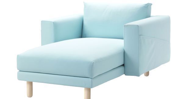
For marathon television-watching sessions during winter, a chaise longue provides maximum comfort and relaxation (Norsborg chaise €380 at Ikea).
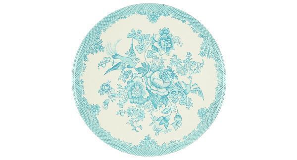
A new table-top look for spring blends 2016’s blue with vintage patterning in the Rosalie plate from M&S (€13).
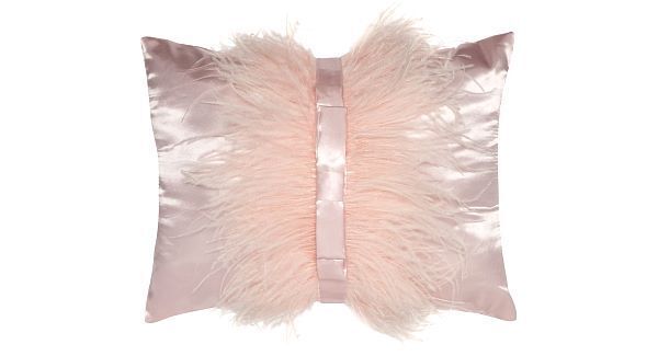
Julien MacDonald’s satin and fluffy cushion offers a touch of bling with pink at its most feminine (€37.50 at Debenhams).
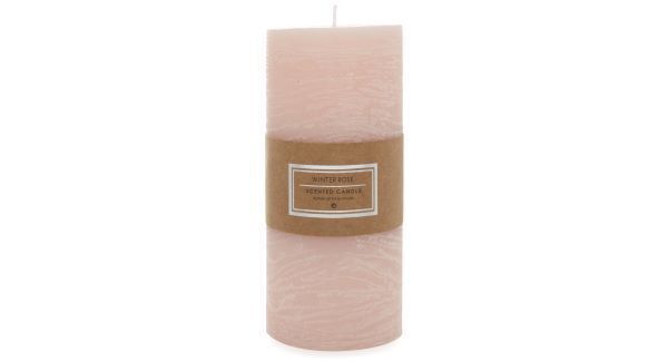
Match Colour of the Year Rose Quartz to a complementary aroma with the Winter Rose candle from Penneys (€2.50).
