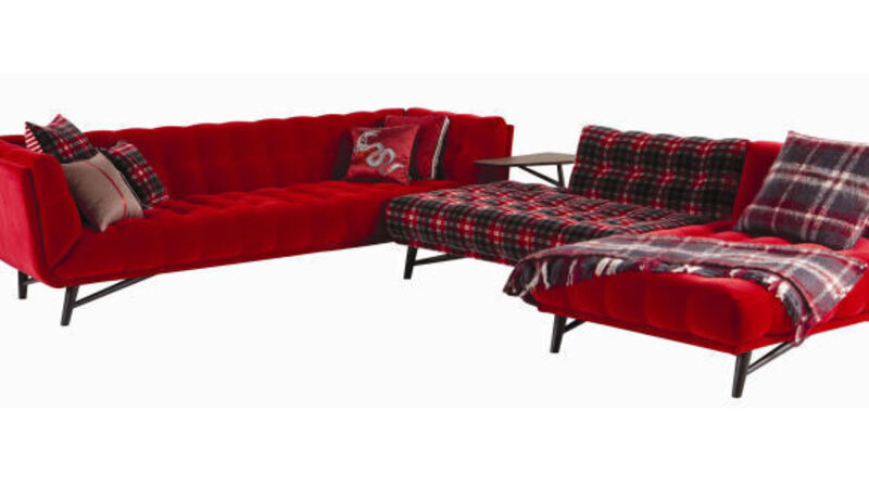
Glad to be plaid

Pattern requires courage in its application, unless, of course, you’re using dainty little florals and narrow guage stripes, which are nice and safe. Not that there’s anything wrong with the safe approach. I have to say, it would be my own way of going about things, were I to step into a home-interior pattern project.
But if you fancy the vogue for pattern as it’s applied this season, then it’s mainly about large scale and boldness, which, let’s face it, may not appeal to everyone, especially if you’re living in a compact space.
In general, pattern works in every space, giving it texture and life, but the extent to which you apply it will dictate its success.
Do bear in mind, once you commit to the larger prints and patterns of, say, wallpaper and upholstery, any small pieces of pattern you may already have can end up looking timid and lost in your pattern scheme.
Another important consideration is colour and how much of it is used. Your colour scheme will dominate the mood of the room, so think about this before you get carried away. Colour will also dictate how your pattern fits in, so work with it in a way that will create harmony between the two, rather than an unbearable clash you and your fellow house dwellers find difficult to live in.
As a starting point, consider three simple rules. Firstly, avoid just one size of pattern, especially having too many small, tight versions together. They can dazzle the eye and not in a good way. Equally, a huge, modern geometric pattern on wallpaper won’t sit well with your flowery or check upholstery.
Secondly, you’ll need some light relief, so a white background or any neutral — even the soft greys that are in fashion — dilute a pattern’s impact and create an illusion of the space feeling roomier and not hemmed in by too much going on.
If you’re not a fan of neutral — white, cream, beige — and have bought into the trend for colour, then a single block colour will have a similar effect, if it’s not too dark. The darker the colour, the smaller the space feels.
Thirdly, try to create harmony in your pattern mix. You might opt for a new slew of cushions to perk up some tired upholstery, so try one of two things. Either use one type of pattern, such as geometric or a selection of checks and tartans, set against different colour backgrounds, or be brave and choose three types of pattern, picking from checks, spots, stripes, graphic prints, motifs and animal prints, but all with the same background colour to make the look cohesive and not like a run of cushions on a shop shelf.
If this is working for you and confidence is rising, the latter choice could go a step further by taking your mix of patterns, and rather than having a single-colour background, you have a variety from the same family of colour.
Think of blue in its various forms of navy, royal, sky and baby, but no competing mix of black-and-gold tiger print with green and pink floral. Be brave, but be wise, too. After all, you’ll have to live with the result.


