Colour it

Lovely though it is, doesn’t late winter light have an awful habit of showing up shabby paint work and faded colour schemes, especially after the Christmas decorations have come down?
Add in dust spewing turf fires and even the more contained solid fuel stoves and central heating radiators, and you have cobwebs growing like woolly stalactites from the ceiling, and the gleam taken off your freshly glossed woodwork. So colour charts to the ready folks: it’s time for the spring decorating project.
First of all give thought to the atmosphere you want to create before you choose a scheme. If you want cosy, avoid pale grey, but slap it on if you want a brush with sophistication. Think about how colour will look against things you are keeping, such as floors and sofas.
This considered approach gets you on the right track, but leave some thinking room to make a choice you’ll also enjoy.
Colour doesn’t have to be applied to walls. With increasing emphasis on sustainability and reusing, try applying paint to furniture, or adding some new colour to an existing wall paint scheme.
When it comes to buying any paint colour, do get a sample pot, slather it onto wallpaper backing paper and move it around the room for a few days to see how it responds to changing light.
Don’t forget to look at it under artificial light where the character of the shade can change considerably.
This year we’re trending a sumptuous palette of confident, vibrant colour schemes with rich indigo taking the lead.
Even if you favour the red and burgundy family you cannot fail to cast an appreciative glance at this warmed up kinsman of blue.
There’s something rather energising about it too, especially when partnered with relaxing neutrals, lighter greys in particular.
If anything, the underlying theme in the colours being touted this year is balance. Indigo used with a greyish white just about sums it up. So too does green.
Rich emerald tones and pale whitish greens evocative of tender young shoots have all the promise of spring and summer.
If the vibrancy of indigo is a tad too sophisticated, pastel pink and green combinations are in vogue with orange and lavender are also part of the look, sometimes using several of them in one scheme. Beware that decorating in these colours may make your space look like a bag of Dolly Mixtures unless you are a very confident colour user.
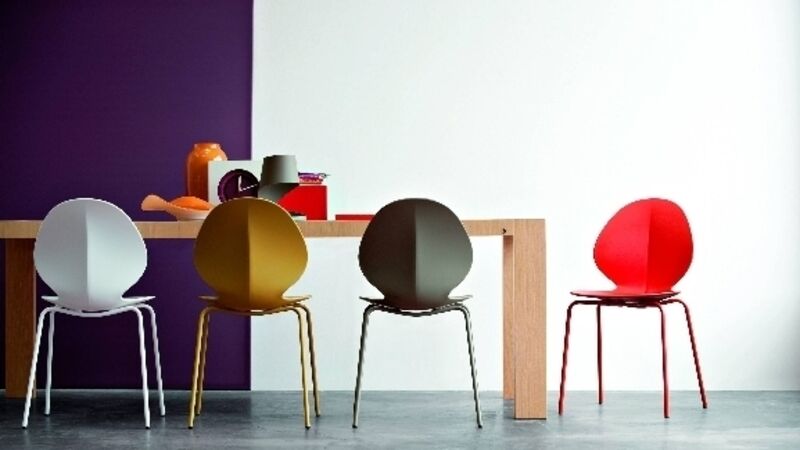
For a version with a little more edge consider introducing the look with accessories rather than paint, set against a white or light grey background in furniture or walls. Even small amounts of these colours behind a set of open bookshelves can really alter the focus of a space.
For a subtle version consider the faded almost degraded pinks and mauves.
They’re new but also have a touch of nostalgia in their composition, a visual solace of sorts, which work alone, or with the aged tone of smoke yellowed woodwork. They even make a striking accompaniment to the colour of the year: indigo.
* Next week we’re getting comfy on pouffés and ottomans.